

Red Pigmented Watercolour Paints
After my study of yellow pigments, here are the red pigments.
Ah, this red, bright, hot, vibrant, exciting and so special ... a sign of danger and passion, rare in pure hue in nature, yes the flowers show us these notes ...
It's true that red is not a primary shade, because it can be created. Indeed, the red is obtained by mixing yellow with magenta ...
I created a preview of what can be mixed. I used 7 yellow pigmented mono with 4 magentas naturally mono pigmented too. I did not add blue, but by doing that we get closer to the colours like the lacquer of madder to see dark perylenes.
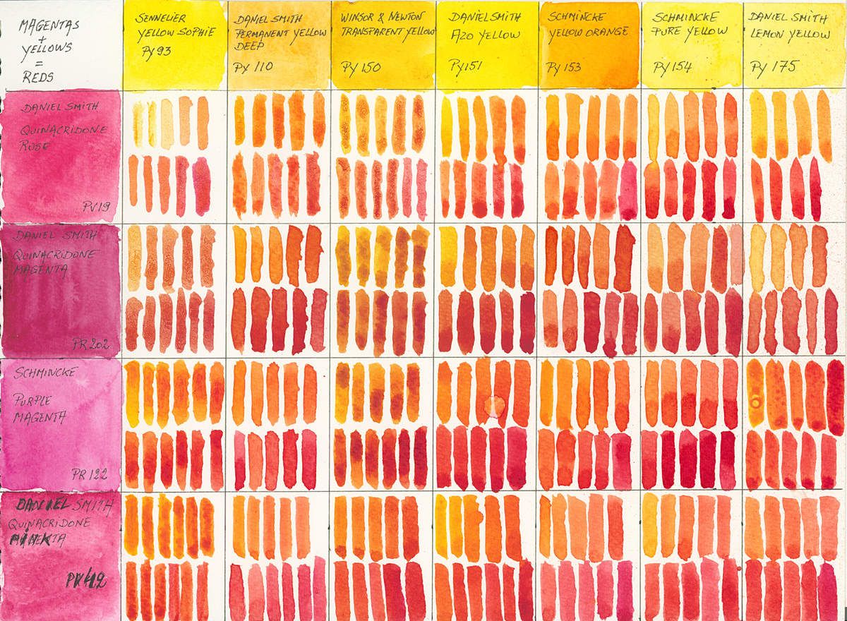
So you can see that in most cases we can deprive ourselves of red in his palette. But in this case you need at least one magenta.
Flower or portrait painters may need specific red tints. But on average a hot red type vermillion or more neutral like the red of quinacridone or the red of pyrrole by adding a cold red red crimson style of alizarin or of the lacquer of madder (Attention, use the paintings resistant to the light, because the originals of these colours are very fugitive and become brownish at the exposure of the sun and fades to see them disappear in a few years or months ...)
And yet, thanks to cosmetics, there are more red pigments than any other colour pigments… To lose his soul ...
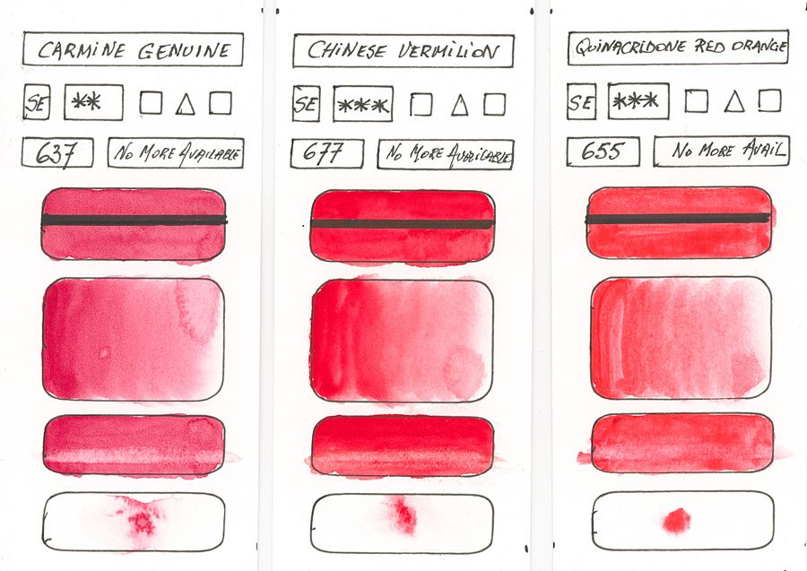
But back to brushes and samples. As for the yellows I made you a chart showing the main characteristic of each red pigment. Yes, there are more, but these non-referenced pigments are rarely used in our watercolour paintings.
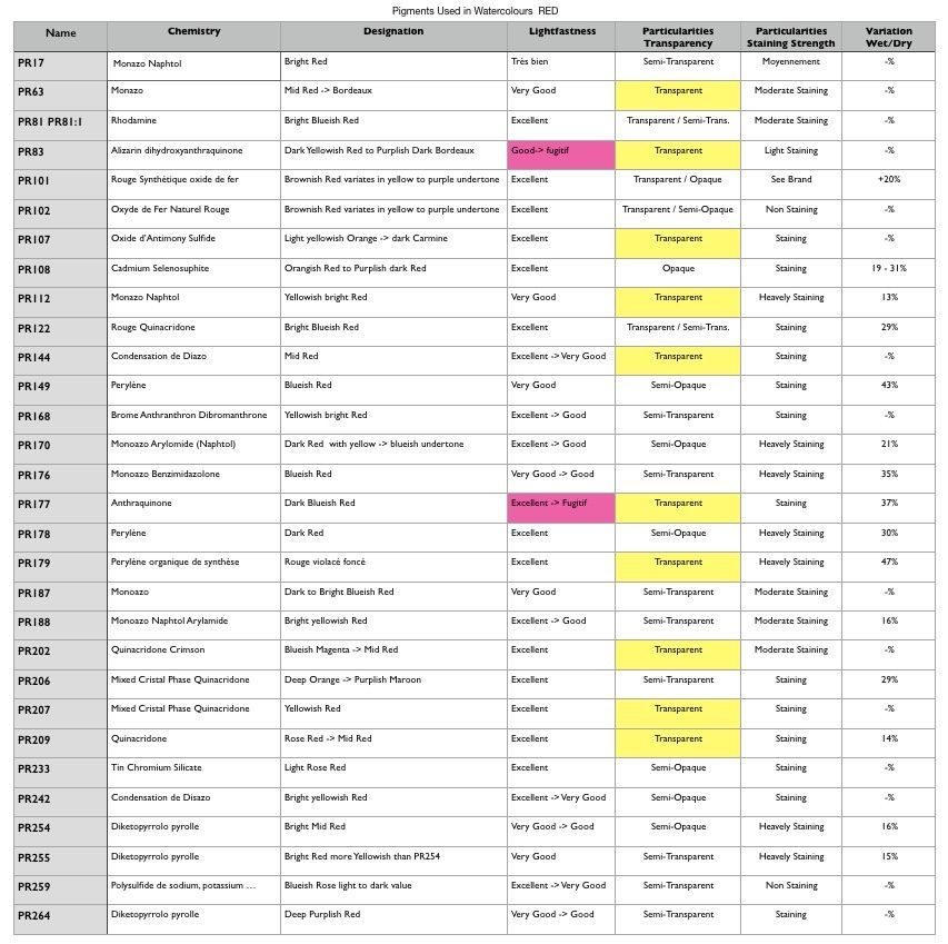
To better understand and not to repeat myself, I advise you, if you have problems to analyse the samples, to read the beginning of the article on yellow pigments. All the abbreviations and explanation are there. Use this link to get there.
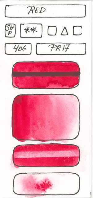
PR17
Monoazo Naphtol
A bright red, but not very resistant to light. Better to avoid it.
PR 63
Monoazo
Mid shape red. I did not find any indications regarding the light resistance.
PR81 & PR81: 1
Phosphotungsto molybdic acid
A bluish red fluorescent bright transparent. Little resistant to light
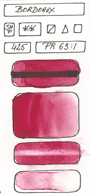
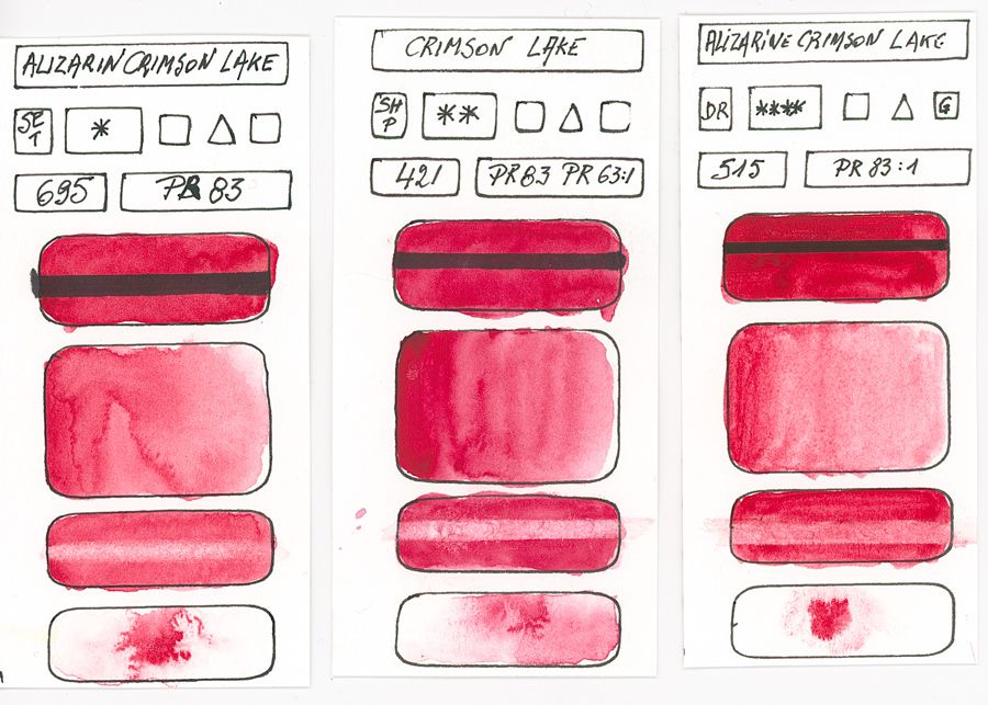
PR83
dihydroxyanthraquinone
Intense dark red with a bluish sub-tone. Fugitive, staining and transparent. The pigment refers to the Madder Lake from which the alizarin crimson is derived. The colour loses a lot of saturation and clears as it dries.
Given the current possibilities to choose a more stable and light-resistant substitute, I do advise you to omit this nuance from your palette.
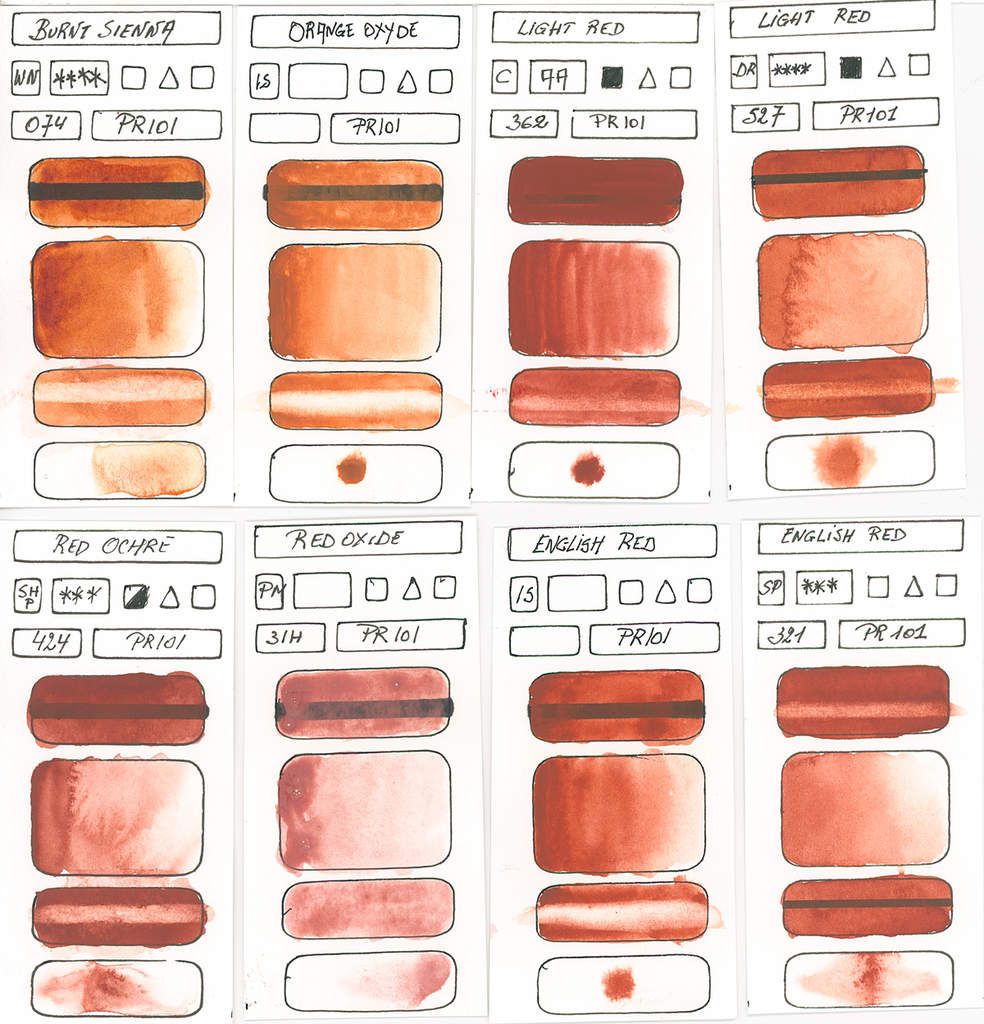
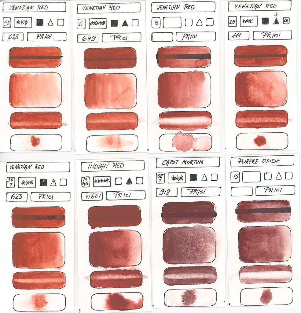
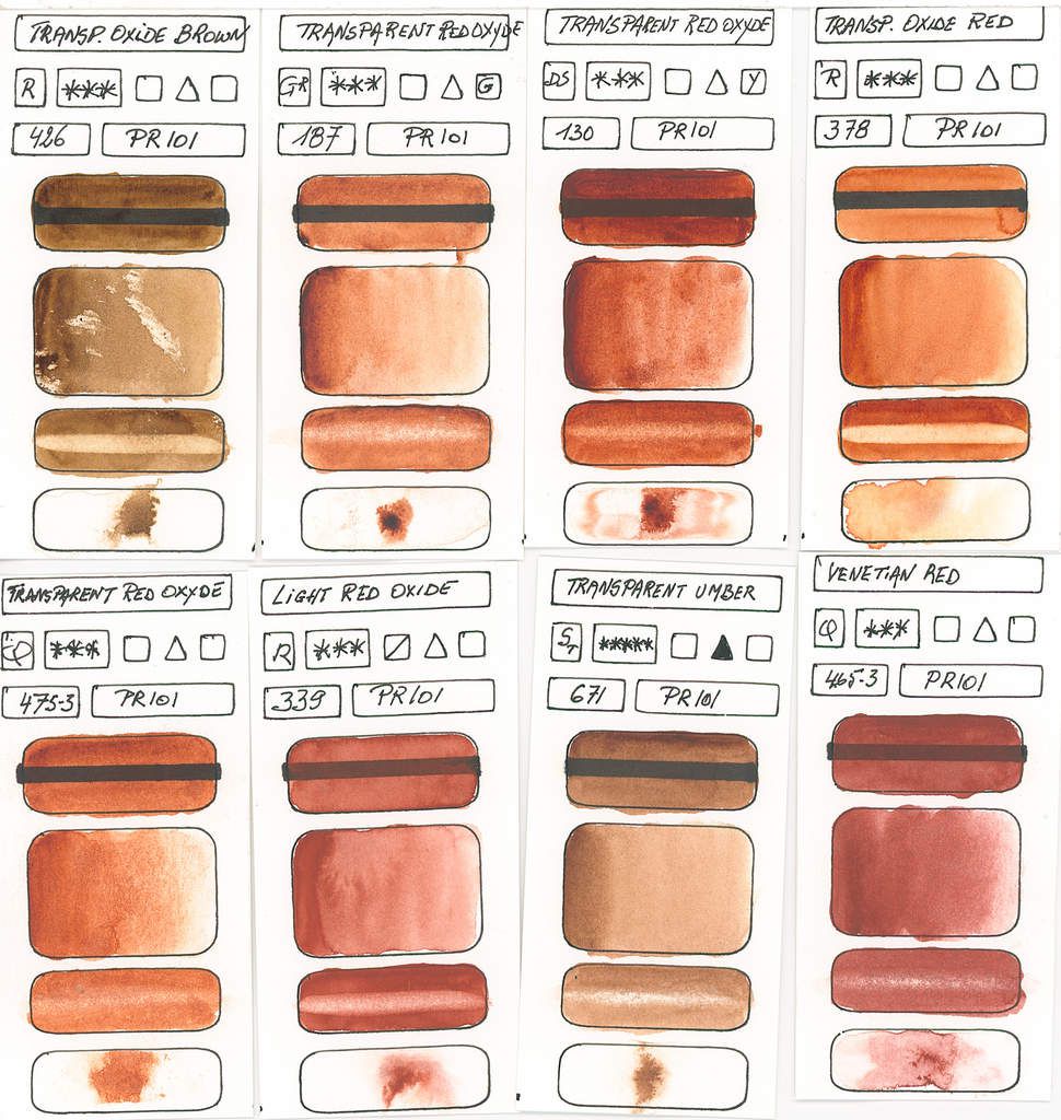
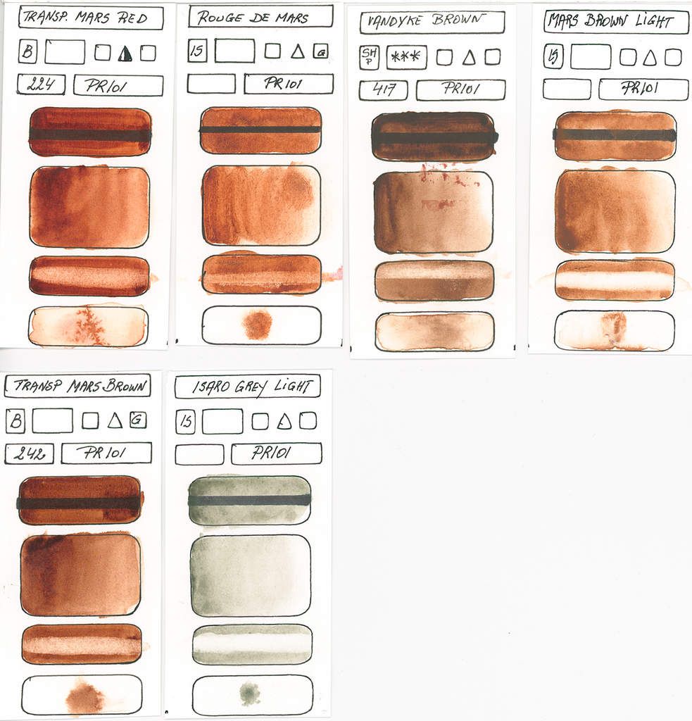
PR101
Synthetic Iron Oxyde
Often classified in earth tones, I classify it in the reds given its international name PR (Pigment Red).
Red ranging from brownish yellow to orange reds with an undertone hue varying from yellow to purple. Depending on the composition and treatments the watercolours created with this pigment vary from transparent to opaque. (This is also due to the fineness of grinding, the binder, the method of manufacture, impurities and additives).
Paintings made from this pigment and its natural counterpart PR102 exist in almost all shades of yellow, orange, red, purple brown to greenish browns.
It's one of the most light-resistant shades in reds. All PR101 are staining. They lose a lot of saturation during drying.
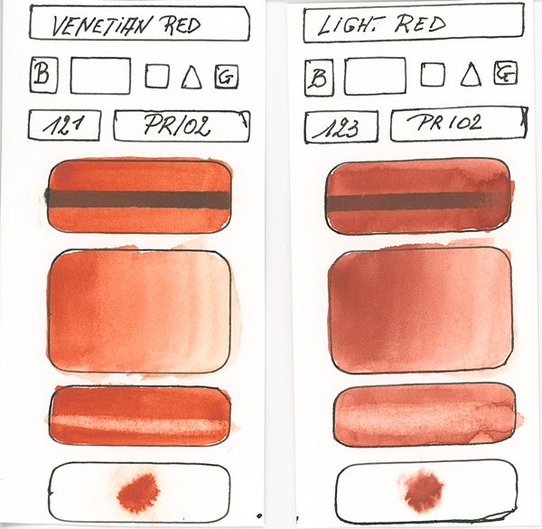
PR102
Anhydrous Iron Oxide Natural.
Often classified in earth tones, I classify it in the reds given its international name PR (Pigment Red).
Colour varies from brownish yellow to orange, to reddish tones with a shade of yellow varying to violet.
According to the formulation, this watercolour can vary from transparent to opaque with all the intermediate transparencies.
Like the synthetic PR101, these paints have excellent lightfastness. But unlike the PR101 these colours are not staining.
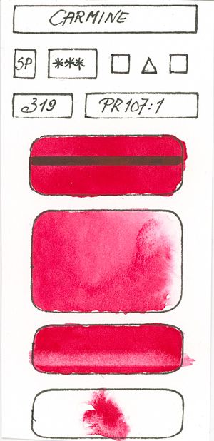
PR107
Red Antimony
Variating from a light orange yellow to a deep carmine.
This red is transparent and of excellent resistance to light.
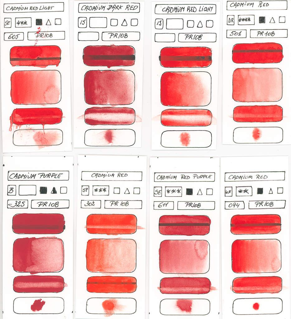
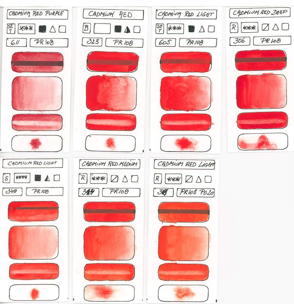
PR108
Cadmium Barium Selenosulphite
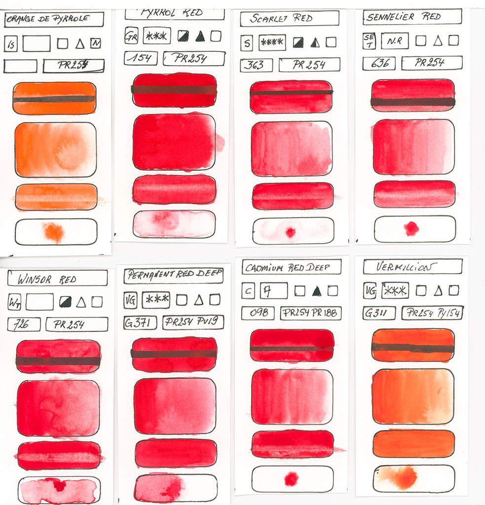
Orange-red ranging to deep purplish red. Opaque paint with excellent resistance to light and staining. The drying shift is light to medium and the shades lose between 15% (light shades) and 30% (dark shades) of their saturation. The traditional red used before by watercolour artists, but because of its toxicity is often replaced nowadays by Pyrrole Reds.
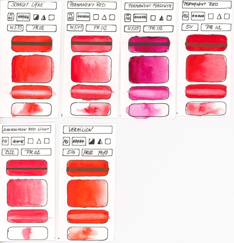
PR112
Naphthol Red
The PR122 has a very good lightfastness, transparent and very staining. In an intense orange-red . When drying the saturation loss is about 10% and the overall drying shift is very slight.
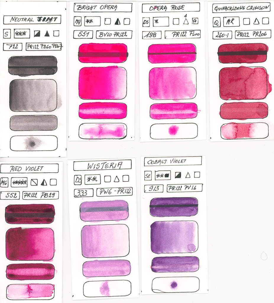
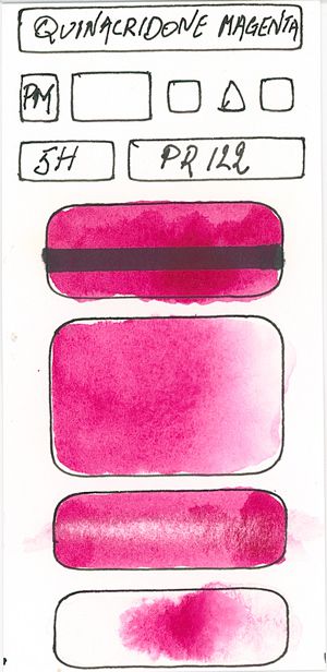
PR122
Monoazo Red Naphtol
Intense light yellowish red which becomes more dull and dark when drying. Semi-transparent to semi-opaque, this red has a very good to excellent resistance to light.
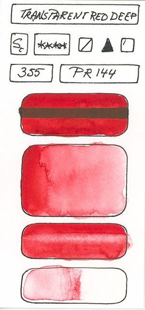
PR144
Condensation of Diazo
Red of medium shade of very good see excellent resistance to light. Opaque to semi-opaque.
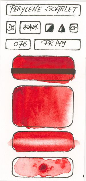
PR149
Perylene red
Intense red with a blue sub-tone, semi-opaque, very good lightfastness and a very strong staining force. Used to replace the Alizarin Crimson who is fugitive (PR83). Becomes darker (sun exposure) when drying, it loses 25% saturation and 15% in tone and turns slightly brown.
PR168
Brominated Anthranthron
Intense yellowish red that becomes darker when drying. Semi-opaque to semi-transparent and staining, this red has a very good to see excellent resistance to light.
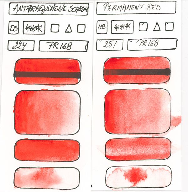
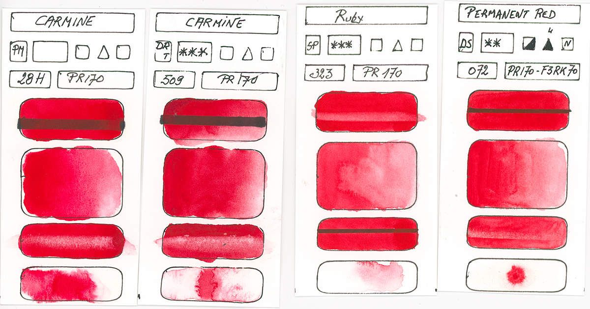
PR170
Monoazo Arylomide
Red ranging from dark yellowish red to bluish red. The lightfastness varies from excellent to good according to the brands (to be tested before using), ranging from semi-transparent to opaque. A 20% saturation loss occurs during drying. A light red geranium type for botanical painters or flowers.
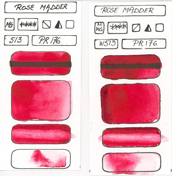
PR176
Monoazo Benzimidazolone
Bluish red that tarnishes and becomes more blue as it dries. From a very good to good resistance to light and very staining, this paint is semi-transparent, which makes it a substitute for crimson Alizarin. The paint becomes lighter by 10% and loses 23% of its saturation as it dries.
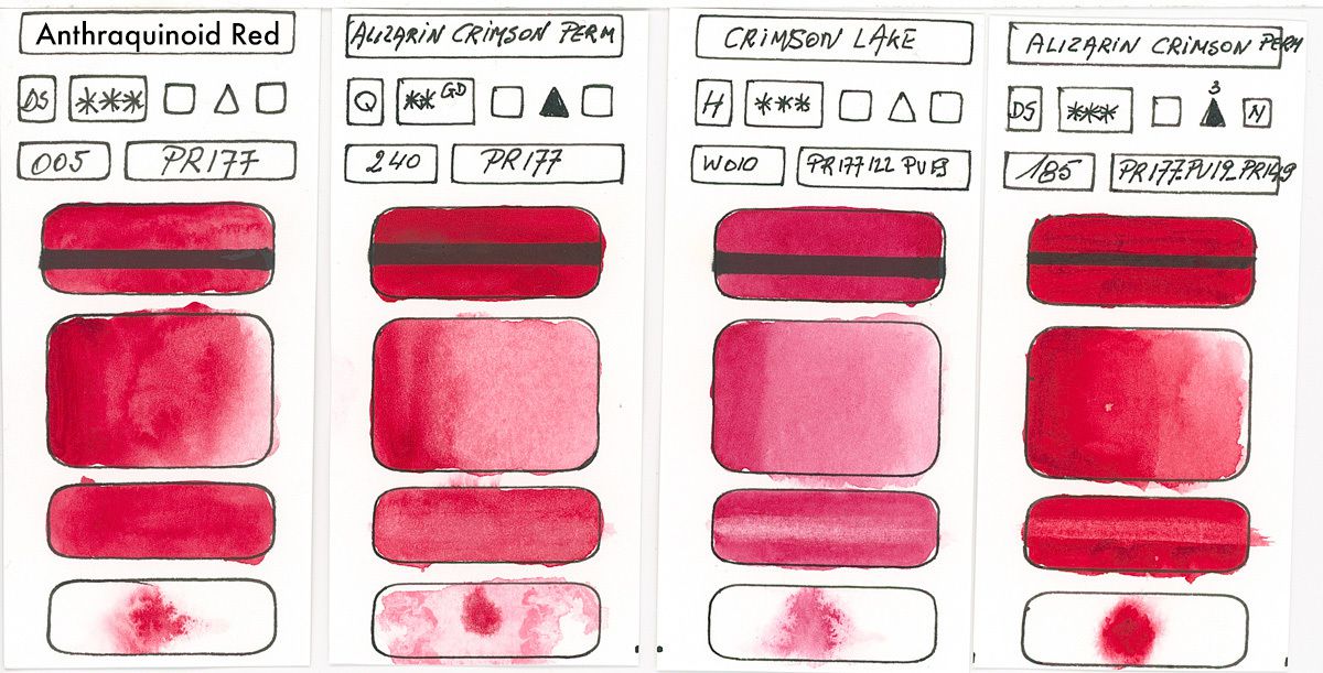
PR177
Anthraquinone
Deep bluish red. From a very good to medium resistance to light (according to brands, do your tests), this shade is transparent and staining, which makes it a good substitute for Alizarin's chamois, even that the hue is a little different in nuance.
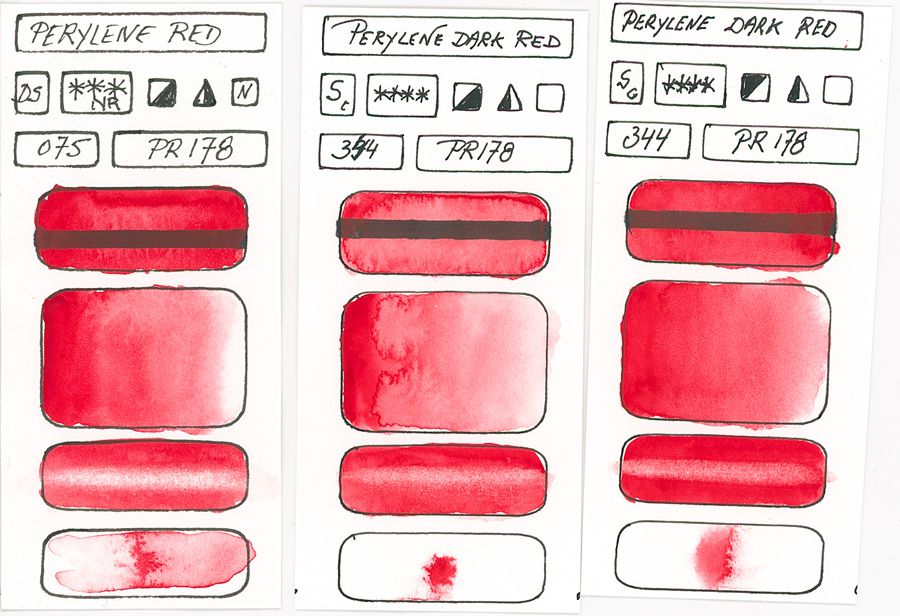
PR178
Perylene red
A deep red that fades a little while drying and has a great staining force. Semi-opaque and excellent in light resistance. Drying results in a loss of almost 20% of saturation and by lightening slightly.
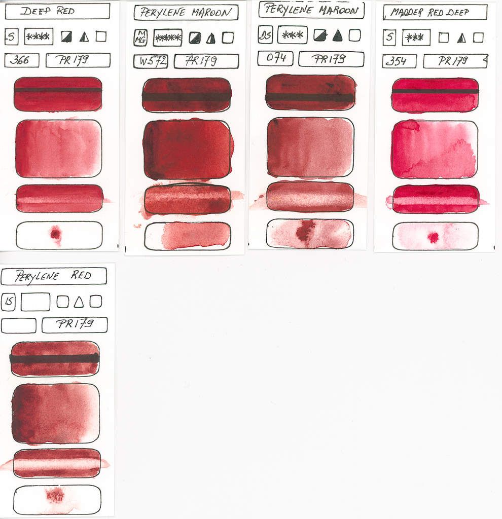
PR179
Synthetic Perylene Red
Deep purplish red fades a little while drying and also loses some vibrancy. Transparent and excellent in light resistance, this paint is very staining. Drying Shift shows a lightening of 17% and a saturation loss of 30%. Without the blue sub-tone of alizarin, this is another approach to replace it. With the PG7 Green Phtalo blue shade, we obtain deep blacks, denser than with the pigments derived from carbon pigments.
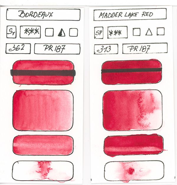
PR187
Monoazo red
Bright red or deep with a bluish sub-tone. Transparent and very good resistance to light.
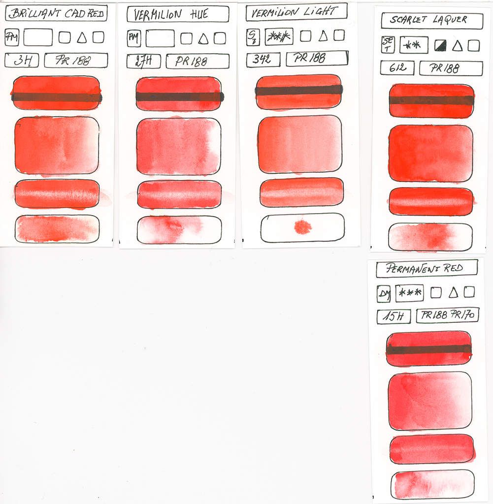
PR188
Red Naphthol AS GOOD arylamide type Monoazo
Bright yellowish red that darkens, tarnishes and fades a little while drying. Semi-opaque to semi-transparent, this red has a very good to see excellent resistance to light. The drying shift is slight and there is a loss of 15% saturation. An alternative to cadmium red if we fear their toxicity.
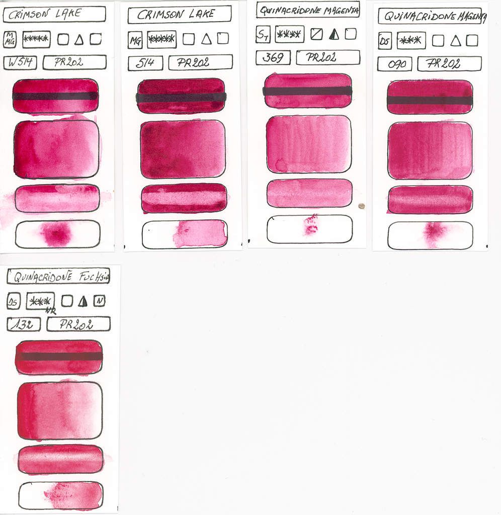
PR202
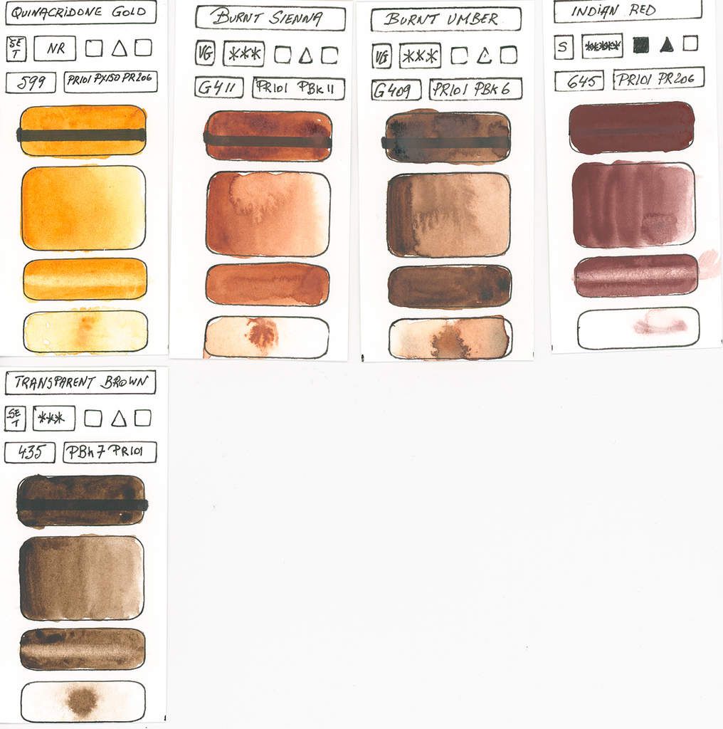
Quinacridone
The quinacridone variant of alizarin crimson. Magenta with a blue sub-tone varying to a medium red. Transparent according to the formulations and marks and excellent resistance to light.
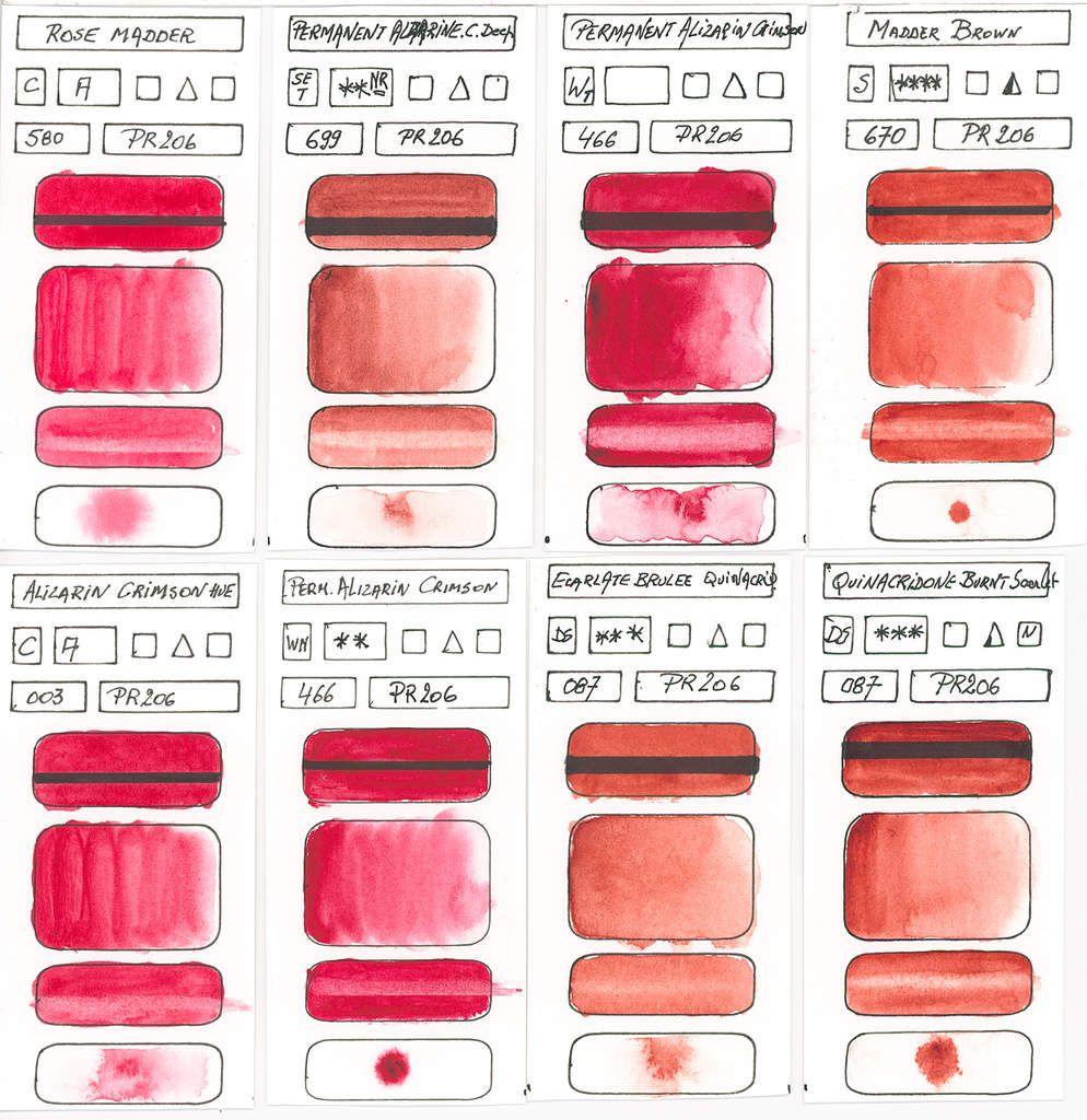
PR206
Quinacridone mixed crystal phase
Dark orange with a brownish purple tone. Transparent and excellent in light resistance, it is a good substitute for Madder lake. In colorimetry, this shade is equivalent to alizarin Crimson but with a more brownish tendency and an orange sub-tone.
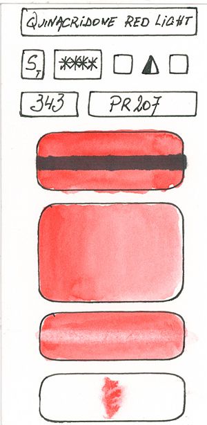
PR207
Substituted dichloro-quinacridone
A red-yellow that fades. Excellent resistance to light, this paint is semi-transparent to semi-opaque
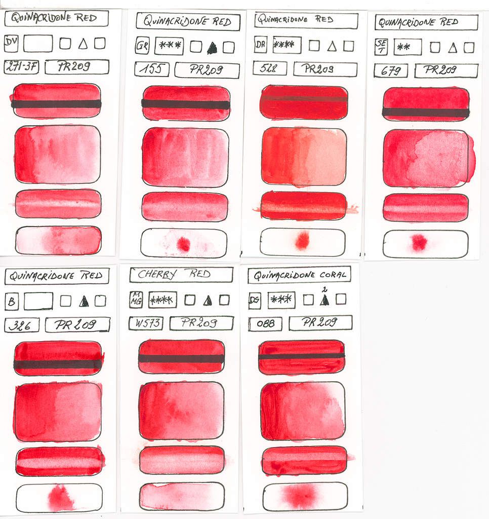
PR 209
Quinacridone
Quinacridone Rose varying to a medium red. Fades and the colour turns blue when drying. Transparent like most quinacridones, it has excellent lightfastness and is staining.

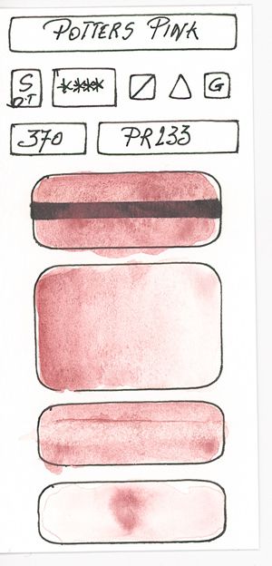
PR233
Chromium Silicate Tin
Light red varying to pink. Semi-opaque and excellent in light resistance.
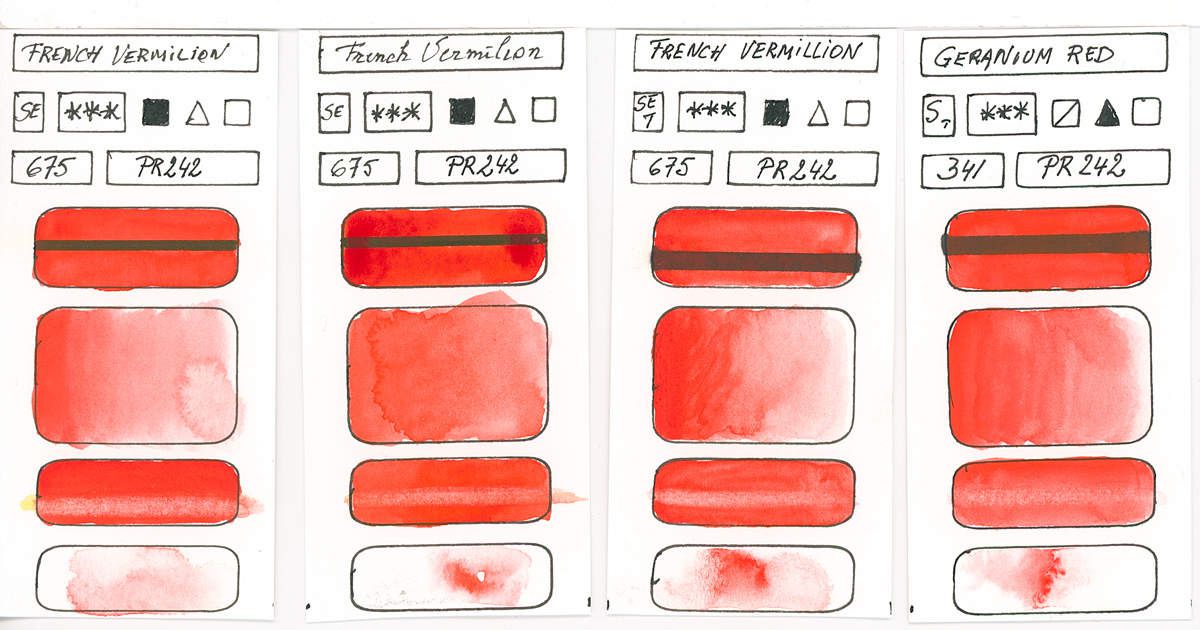
PR242
Vermillion of Disazo
Moderately dark, bright yellow red, which tarnishes a bit and turns blue, losing about 15% saturation when drying. Semi-opaque, very staining and excellent resistance to light.
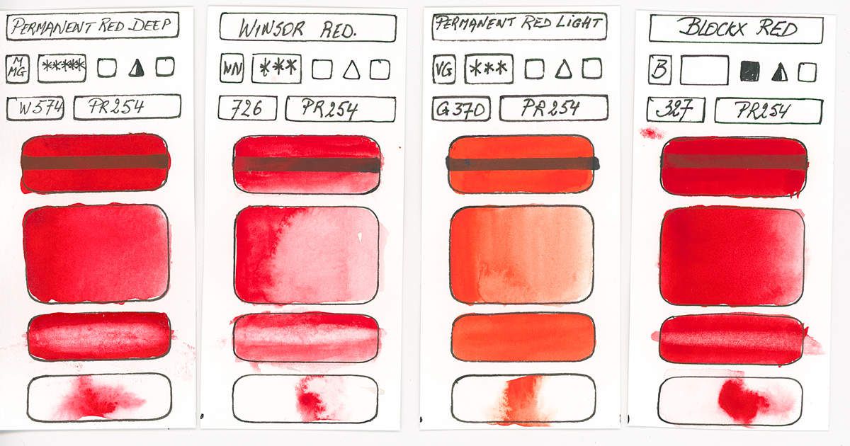
PR254
Pyrrole diketopyrrolo
Medium red, see darker, shiny that can fade or turn slightly blue when drying. Excellent light fastness, this paint is opaque to semi-opaque
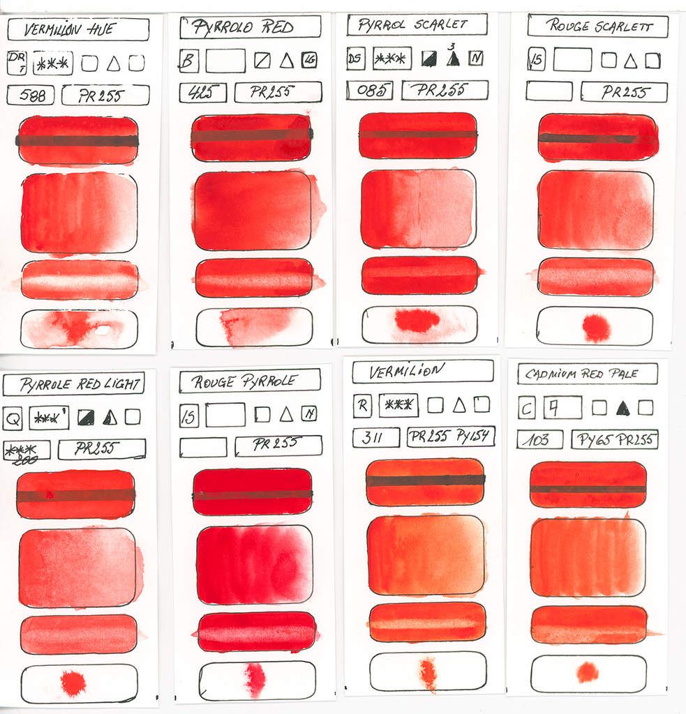
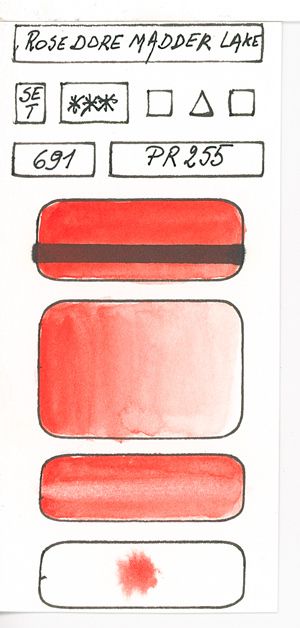
PR255
Pyrrole diketopyrrolo
Bright yellow more yellow than PR254. Semi-opaque and of excellent resistance to light. Very staining this paint loses about 15% of its saturation during drying.
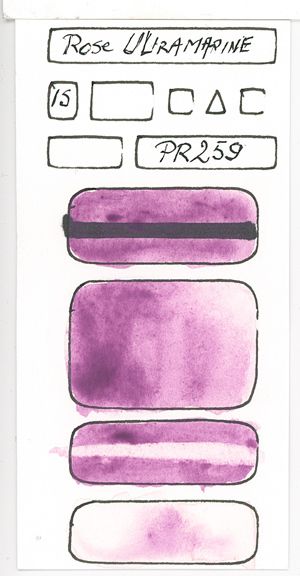
PR259
Sodium polysulfide, potassium, lithium or silver.
From a dark red to a bluish pink. Semi-transparent and excellent in light resistance.
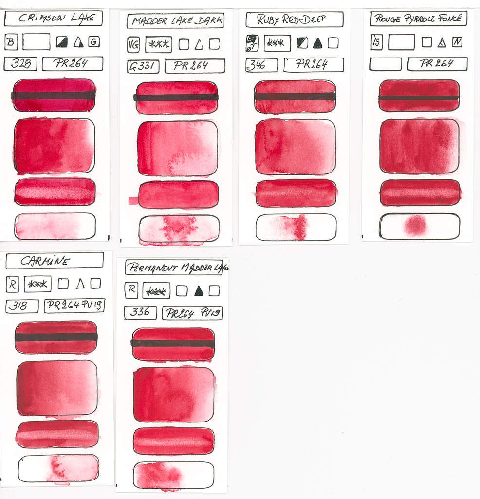
PR264
Diketo pyrrolo pyrrole
Deep dark red with a purplish sub-tone. Dulls slightly. Excellent with very good lightfastness and it is semi-transparent, this colour is an excellent replacement for alizarin crimson
Reds without Pigment Information
Discontinued Colors
CONCLUSION
Reds are not often found pure in nature. Great exception are and The flowers that show us a panoply of shades ranging from fragile roses to deep bluish reds. Some days, we can also see in a sunset at sunrise all different shades of this color. For some centuries, the red had the reputation to tarnish or brown over time.
The extract of the madder root, which provided the chilli for the creation of madder's lacquer and alizarin crimson on employees for the creation of roses and red bluish trend. Even if today, some manufacturers offer us this pigment, better to ignore it because its instability in the light will tarnish your works.
For a long time red cadmium was the only stable and bright red. The problem of its toxicity and its poor transparency do not make it an ideal shade for watercolor, even taking into account vibrations. Today with the arrival of new pigments, especially Quinacridones, Perylenes and Pyrroles, watercolors have a very wide range is nuanced in terms of the choice of shades of red color.
LOOKING FOR THE PERFECT RED
The Neutral Red:
Traditionally, many artists use cadmium red as a neutral red, but this tint tends to be opaque and has some toxicity. As a result, two possibilities are at our disposal with the most recent pigments based on pyrrole, perylene and Quinacridone pigments. Naturally, it is necessary to choose, because the shades are different according to the manufacturers. A notion for the PR255, the red Pyrrole, which despite its semi opacity is closer to a neutral red. Attention, the hue varies according to the manufacturers.
Neutral Red: Cadmium red was and still is the neutral red used by many artists. But with the arrival of new pigments, less harmful and more transparent, many watercolorists have adopted other nuances.
As a neutral red I advise you to make your choice between;
* The Pyrrole Red PR255 even if it has according to the brand a tendency to become a little orangeish
* The Pyrrole Red PR254 a little colder than the PR255
* Quinacridone Red PR209 which is also the most transparent, but shows a sub-tone of pink
* The Red of Perylene PR178 neutral but semi-opaque or semi-transparent.
* Naphtol red transparent but more orange in some manufacturers.
The cold red:
The reference is Garance Red Lacquer or Alizarin Crimson. These reds are transparent, but they have the big problem of being fugitive and dull to light. Many manufacturers have tried to reproduce these hues as well as Carmine through the use of pigments more resistant to light.
Like cold red, I advise you to make your choice between;
* The Anthraquinone Red PR177 Transparent variant of neutral bluish to bluish pink
* Red Monoazo Arylamide PR170 approaching Carmine tint
* Red Monoazo Benzimidazolone PR176 semi-transparent and approaching the shade of Garance lacquer
* Red Anthraquinone PR 177 transparent, tinting but quite close to Alizarin Crimson.
* Synthetic Perylene Red PR179 varying between Garance Brown and Garance Red.
* Quinacridone Red PR202 rosier than Alizarin Crimson, transparent but tinting.
* The Red Diketo-Pyrrolo PR264 is the closest shade to semi-transparent or semi-opaque Alizarin Crimson, the shades vary greatly depending on the manufacturer.
Warm Red :
It is pretty easy to get hot red using magenta and adding a neutral or warm yellow. But there are a lot of yellow pigments that can give a stable base for your mixtures. PY110, PY65 and some variants of PY150 and PY153 may be involved in these mixtures.
Otherwise, as warm red I advise you to make your choice between;
* Naphtol Red PR112 Transparent and Tinting (Attention tones vary by manufacturer)
* Naphtolo AS Red semi-transparent and tinting
* Vermillion de'Disazo orange red bursting semi-opaque
* Red Diketopyrrolo PR255 Red glowing slightly yellowish semi opaque
You have to make your choice, because to choose a color, you have to analyze its style and preferences. I can not guide you in this choice, which is the most personal and specific to your intuition and feelings
Last tip ... Never mix 2 opaque colors as the result will be quite disappointing and soulless.
In a few weeks I will publish my article about blue pigments. It will be faster than the red ones because the blue pigments there are less blue pigments than red and yellow ones !