Orange Pigments for Watercolors
Orange, this secondary color, which is the marriage between the joy of yellow and the passion of red. A color very difficult to define because it is positioned between the Indian yellow (or is it already an orange,) and the scarlet that is located in the reds.
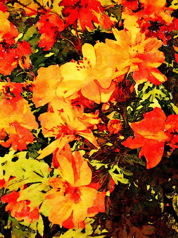
Orange is omnipresent in this autumn period, but it is also found in deserts, land, flowers, and fruits to not forget the vegetables (carrots).
Is it essential to have an orange in its palette? Indeed we get pretty shades of orange in mixing a neutral or warm yellow with a pink or magenta. Be careful to use only the color "red" because it will quickly dominate the yellow!
And yes, according to my experiences, we must add an orange to his palette. Mixes all have less vibrancy than pure pigments, but that's not the only reason to bring it with you. Orange is complementary to blue and only, for this reason, it is useful to be able to rely on a fixed orange to tarnish or neutralize these colors.
Mixing an orange with a little blue helps create earth tones like the land of Siena or Shadow, but also gray tending to red or blue. These blends are essential in almost all watercolors. They give depth to your works!
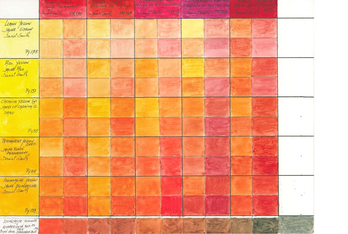
In the first part, I suggest you discover the paintings of different manufacturers classified according to their main orange pigment.
In the second part, this will be posted soon in another article, I will deepen the mixtures or how to mix oranges and also how the orange behaves with other colors. This article will be published after this one under the title Mix Oranges.
Orange Pigments
I do not comment on the oranges used to date by the manufacturers. It is true that there are other orange pigments and I am limited to this list because I only comment on the nuances that I have. As I am completely independent, I have to acquire all tubes or pans to make samples and research.
Here is a table with the characteristics of oranges that I comment.
To better understand the abbreviations and symbols, I recommend you to read my article about yellow pigments :( http://www.desireherman.com/2018/02/the-yellow-you-by-type-of-pigment.html).
And to rediscover the pigments of the primary colors;
Yellow, Red & Blue offers you these direct links:
• YELLOW: http://www.desireherman.com/2018/02/the-yellow-you-by-type-of-pigment.html
• RED: http://www.desireherman.com/2018/03/the-red-pigments.html
• BLUE: http://www.desireherman.com/2018/05/blue-blights-according-the-pigments-for-the-watercolor.html
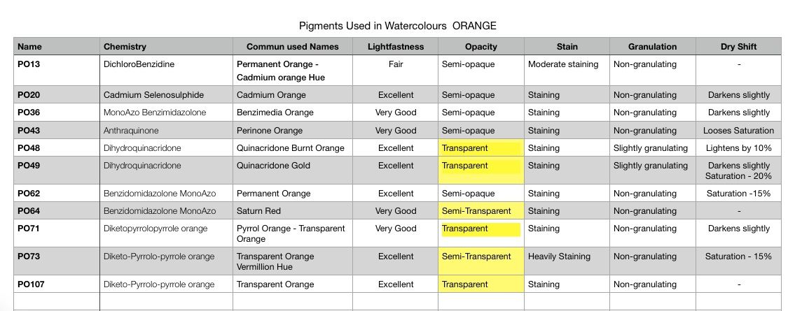
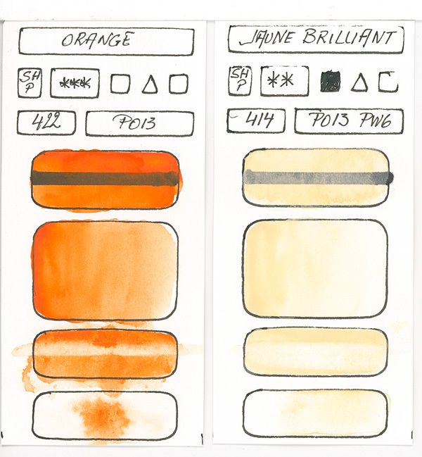
PO13 - DichloroBenzidine
Permanent Orange or Cadmium Orange Lacquer according to the brands.
It is a bright orange, varying according to the composition of an orange-yellow to a reddish orange. With a fairly weak resistance to light, this pigment is little used to create watercolor paints of superior quality. Given its lower cost, it is sometimes found in so-called "student" or leisure paintings.
This orange pigment is like many other oranges, semi-opaque, tinting non-flaking or granulating.
In view of its behavior with respect to exposure to light, I do not recommend the use of this pigment.
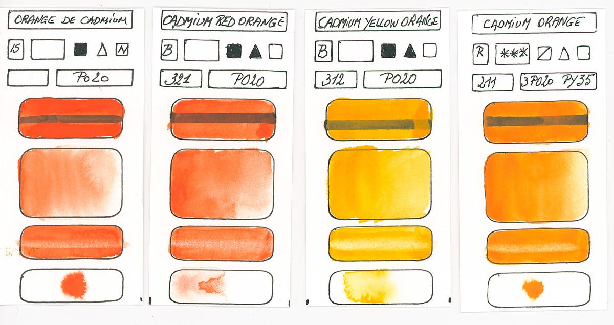
PO20 - Cadmium Selenosulphide
Cadmium orange
Cadmium Orange was the second pigment to be really orange. The only pigment creating oranges were made with Chrome and was widely used by the impressionists who used it as a pigment from 1820.
Cadmium orange which is semi-opaque in watercolor and therefore to avoid in your mixtures, because it will cover all that is below and if we put glazes above the result will be dull.
In addition to its toxicity is better not to use it, since the arrival of Pyrroles, Preinones etc ... we have good saturation pigments, non-toxic and transparent see semi-transparent.
This pigment is still interesting in other areas such as oil painting, pastel etc ... This pigment has the property of being in addition to being semi-opaque to see opaque is very tinting, so difficult to lift or open whites but is of excellent resistance to light. The orange created with this pigment produces oranges ranging from yellowish to reddish, depending on the composition and possible additions such as barium.
« Cadmium sulfoselenide can take any medium to deep orange hue; to produce an orange hue or a lighter value. The high-quality cadmium is extremely durable, covers very well, is easy to handle, is moderately active wet on wet, and easily creates dark circles when wet while still wet (although it is resistant to the formation of halos when dried). It has a powdery luster on the paper and is diluted to give muted hues, clean and almost transparent. All these features give it an unusual and delightful range of texture effects. The only disadvantage is its tendency to tint the paper aggressively. » (Inspired by Bruce McEnvoy - handprint.com)
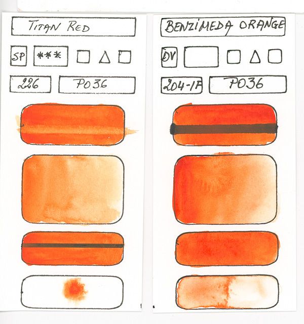
PO36 - MonoAzo Benzimidazolone
Orange Benzimedia
This red scarlet trendy orange has a excellent resistance to light. Tinting, but less than Cadmium orange, it is also semi-opaque but less than cadmium orange.
Closer to a ground color, this orange has less vibrancy than other oranges, but by adding yellow, preferably PY139, we get vibrant oranges. This color is also very useful for mixtures with neutral blue or cold because you get very dark values.
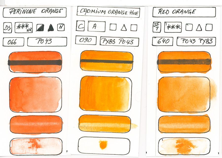
PO43 - Anthraquinone
Orange of Perinone
This pigment produces an almost neutral orange or a yellowish tendency. It has very good light resistance and is only moderately tinting (less than other oranges), does not pellet and is semi-opaque like many other oranges.
Very rarely used in watercolor paintings, the only pure ones I found came from Daniel Smith and White Nights (Saint Petersburg).
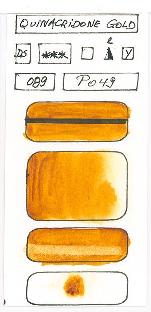
PO48 - DiHydroQuinacridone
Burnt Orange - Quinacridone Deep Gold
This hue is a deep orange of a golden reddish hue. It enjoys excellent see very good light resistance and has a medium tinting strength. It is quite far from a standard orange but can be nuanced by the addition of a yellow. As a result, this color helped create the Quinacridone Golds after the disappearance of the PO49 pigment by adding Yellow.
By its transparency, it is very useful for creating greens with the blues that are natural and can be nuanced, more vibrant by adding yellows. You can observe this by looking at the article about the quinacridone gold that I posted a year ago. (http://www.desireherman.com/2017/09/comment-the-world-business-article.html http://www.desireherman.com/2017/10/is-is-- that-daniel-smith-us-cheat-my-observations-on-the-new-quinacridone-gold.html)
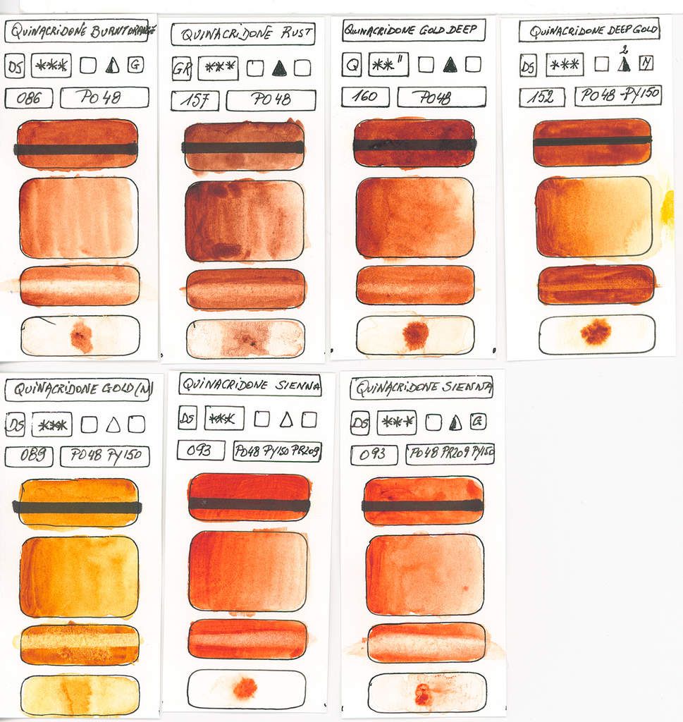
PO49 - DiHydroQuinacridone
Quinacridone Gold
This variant of Quinacridone is much more yellow than the PO48. It has the same characteristics (transparent moderate tinting and excellent to see very good resistance to light and slightly granulating)
This orange, which is more yellow is with yellow-green gold one of the easiest colors to use to create natural hues (green and brown) for the landscape.
Following the disappearance of this pigment, some manufacturers now use an almost similar shade of gold or golden ocher (PY42), but this pigment does not have the transparency of the late PO49.
In order to achieve this color we can use PY150 with either PR179 or PV19 (Quinacridone Rose or Violet) Another approach is the blending of Green Gold (PY129) with PR122 (Quinacridone Magenta).
Fortunately, I still have 5 full tubes, because it's one of my favorite colors.
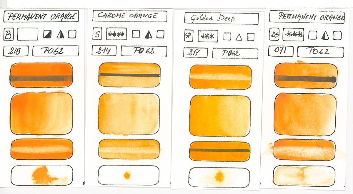
PO62 - Benzidomidazolone Mono Azo
Permanent Orange - Chrome Orange
This orange has excellent lightfastness and its tone is between a light yellow-orange and a medium orange. This color is semi-opaque, of medium coloring strength and moderately dyes the paper.
According to the manufacturers, this orange can change sub-tone.
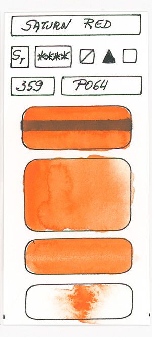
PO64 - Benzidomidazolone Mono Azo
Saturn Red (Schmincke only)
A neutral orange, see slightly reddish, and semi-transparent. With a very good resistance to light, this orange is tinting. This orange also has a nice vibrancy that allows it to be mixed with yellow or red to change its orange color.
In my opinion one of the most interesting, but currently only available at Schmincke and Maimeri Blu.
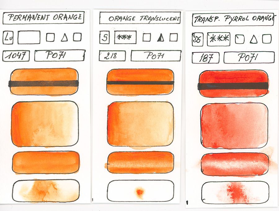
PO71 - Diketo-Pyrrolo-Pyrrole
Transparent Pyrrole Orange
Orange moderately saturated ranging from a reddish-orange to a medium orange. Very good resistance to light and transparent see semi-transparent, this orange is tinting and medium tinting strength see good.
In drying the color darkens slightly.
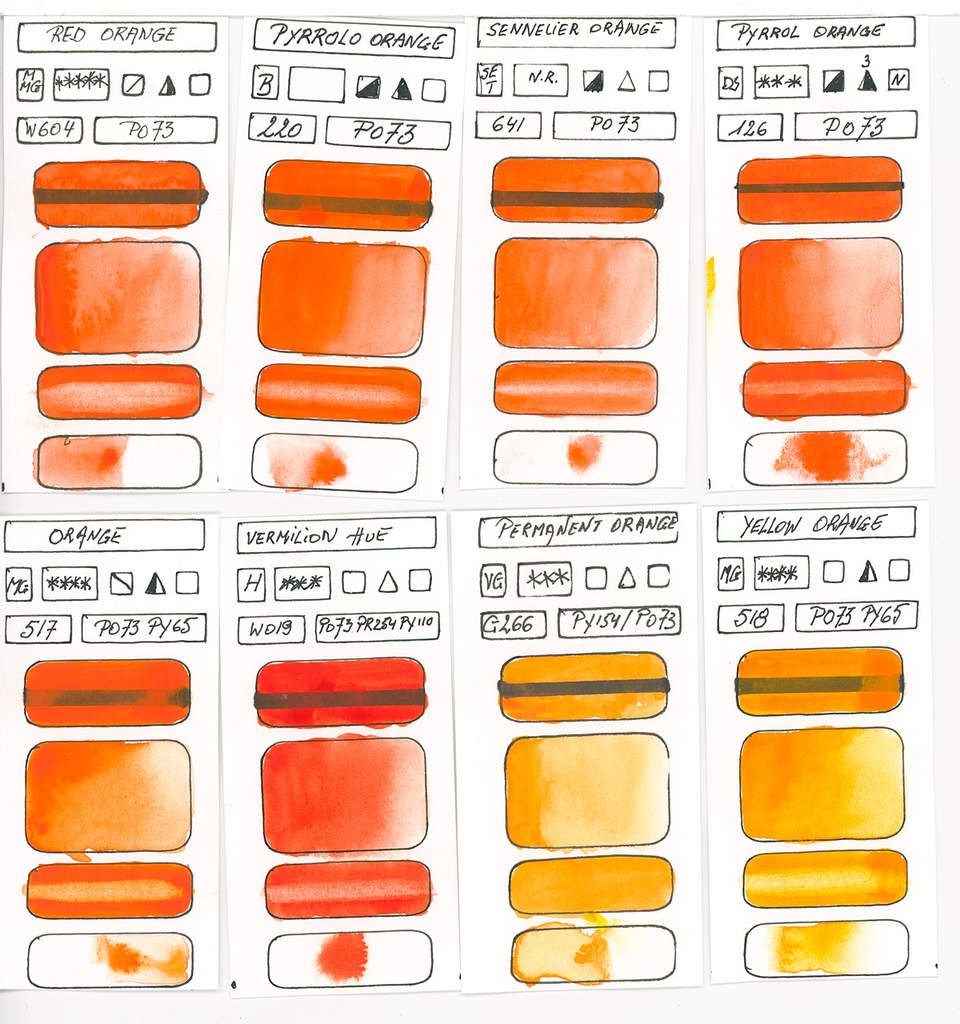
PO73 - Diketo-Pyrrolo-Pyrrole
Pyrrole Orange
This color is an orange-red hue, very vibrant and transparent to see semi-transparent. It has excellent resistance to light and is tinting. It allows obtaining beautiful dark shades by mixing it with blues, even the lightest ones like cerulean blue or manganese.
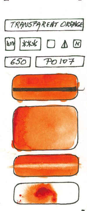
PO107 - Diketo-Pyrrolo-Pyrrole
Transparent Orange (Only at Winsor & Newton)
This orange appeared in the Winsor & Newton Desert Colors set. No other manufacturer (according to my information) markets this pigment in watercolor paints.
Very close to his cousin PO73, this orange is more transparent, tinting less the paper but has a lower vibration force.
In mixtures with manganese blue, it is observed that PO107 produces more greenish hues which prove that it is closer to a neutral orange than PO73.
Conclusion
If the orange is very little present in the ranges of the colors of the manufacturers is undoubtedly the fact that it is quite present in the hues colors of the earth (Siena, hers burned etc.).
On the other hand this secondary color and complementary to the blues is in my opinion unavoidable in a palette because it allows qualifying the reds (making them more vermillion), to tarnish the blues (often unnatural as phthalos) or to make Greens more varied and nuanced.
It is for this reason that I advise to have a transparent orange in its pallet.
You can observe that I am omitting a little bit Cadmium Orange and this is not without reason ... Yes, the cadmium is toxic but in addition, the cadmium orange is opaque. It becomes more transparent (like all opaque colors) when diluted, but since orange is a vibrant color, but of less than the average value, it must often be used less diluted. Because of its opacity, mixing Cadmium Orange with mono-pigmented colors but semi-opaque to see opaque will create mixtures without a soul, dull and if I can say "dead". Something we avoid in watercolor.
Cadmiums, by their vibrancy, are very often used in acrylic and oil paint, but have, in my opinion, too many negative characteristics for current use in watercolor.
My favorites, cause their vibrancy, transparency and tinting strengths are the Pyrollo Diketo Pyrroles (PO71-PO73 & PO107) and the Perinone Orange and if you are a landscape painter the Permanent Orange (PO62) is well suited for the creation of deep greens.
But personally, I selected for my basic palette 13 colors The Red Saturn Schmincke (PO64). I do not hide that I plan to replace it with one of the shades mentioned above especially the Perinone Orange or the PO73, because for me the PO62 gets too close to yellow Isodoline (PY139).
So I'm preparing the second episode for discovering how to mix to obtain Oranges and how mono-pigment oranges will mix with blues to obtain a large spectrum of greyish, earth, greens and neutrals. Stay tuned and here is a preview of mixing for oranges.