

The Ultimate Palette of 13 Colours to Paint all your Watercolour Art
After publishing my article comparing 19 different brands of watercolour paint, I was contacted by quite a few readers. The most cited question was; "Which colours to choose to compose my palette". As the readers could already have made their choice regarding the brand, it was necessary to find a solution.
And yes, even if we do not have a large number of different hues, or if we start, it is always very difficult to compose an ideal palette. Because the biggest challenge before starting a watercolour is the choice of its colours.
After filling more than 700 colour samples from different manufacturers, the hardest part is choosing the shades that will make up my basic palette with only 13 colours (for superstitious artists remove the green or add a pigmented mono violet :).
I know that the choice of colours is very personal and that each artist has his / her favorite. It was necessary to find the primaries capable of creating as many hues as possible, remaining transparent and vibrant.
Many artists have started with watercolour boxes of 24 see 48 colours, often composed of multi pigment colours. Most of the time these boxes contained student grade watercolours and the result was not up to the hoped height.
I also started painting by buying paint tubes and watercolour boxes (Cotman), without really deepening its characteristics, and often it was a disillusionment. I did not take into account the composition of the pigments, its quality of transparency or opacity, nor its tinting capacity ...
For more than 2 years now, I have been immersed in the study of the manufacture of watercolour paintings and in the theory of colours. I learned a lot and therefore I like to share my experiences.
Based on my knowledge of pigments and colour theory, I have challenged myself to find a solution that will suit many artists.
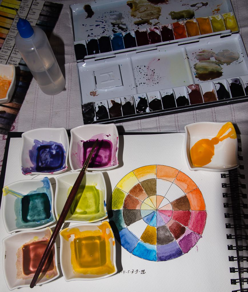
As I already had coloured wheels, composed of the three primary, each in a warm and cold tone (see my article on 19 brands compared palette 3 primary 2 tones) I thought that by expanding the choice to double the primaries hot and cold, I could get to get almost all the colours needed to paint a watercolour. I recommend you to choose only 13 basic colours, preferably of extra fine quality, and start your palette with this choice. By using only this palette, you will soon learn to create mixtures that will be very close to the desired result.
I observed and analysed these colour wheels as well as in the samples I had painted individually.
I asked myself the following question. "What preference to give?"
- So at first, and to obtain the purest colours, I retained only mono pigmented colours, because they are purer and support mixes without becoming muddy. (rule to mix maximum 3 pigments)
- Therefore I also told myself that the colours had to be transparent, because the opaque or semi-opaque shades, create dull colours if mixed, as do shades composed of several pigments. This does not exclude them from the palette, as they are often the final touch of a watercolour. But we must choose them sparingly and always in the last stage.
- And my third criterion was to choose very vibrant and vibrant colours, not tarnished and the purest chroma.
I advise you to start with these criteria. Once the palette has been mastered and you have a good understanding of pigment behaviour, you can add colours that are more difficult to control, such as colours that granulate or flocculate (larger pigments that settle down by gravity or accumulate by (Phtalo's, Quinacridones (not all)), which are opaque or semi-opaque and very staining colours (they are not recommended for glacis because they are too invasive and they overwhelm all underlying colours)
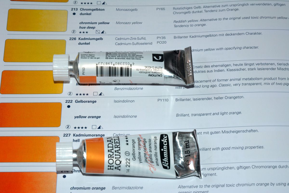
Since the first publication of this article, there was a fault i discovered... On the Yellow Orange tubes i have from Schminke the pigment information arked is PY153. One reader noticed me that it should be PY110, as stated on the Schmincke Horadam catalogue.
So i wrote to Schmincke. Here's the answer i received :
Dear Mr. Herman,
thank you for your question on Schmincke HORADAM colour #14222 yellow-orange.
The pigment inside is PY110 as you can also found in our brochure on page 6 :
https://www.schmincke.de/fileadmin/downloads/pdf/Broschueren_2016/HORADAM_AQUARELL_D_EN.pdf
Sorry, the pigment number on the label (printing data) was wrong. The label is corrected and all next productions have the right pigment on the label.
We hope we can help you with our information and please don´t hesitate to contact us for further questions.
Yours sincerely
Dr. Wolfgang Müller
H.Schmincke & Co. GmbH & Co. KG
So i changed with photoshop the identification on all color wheels and charts sorry for the inconvenience.
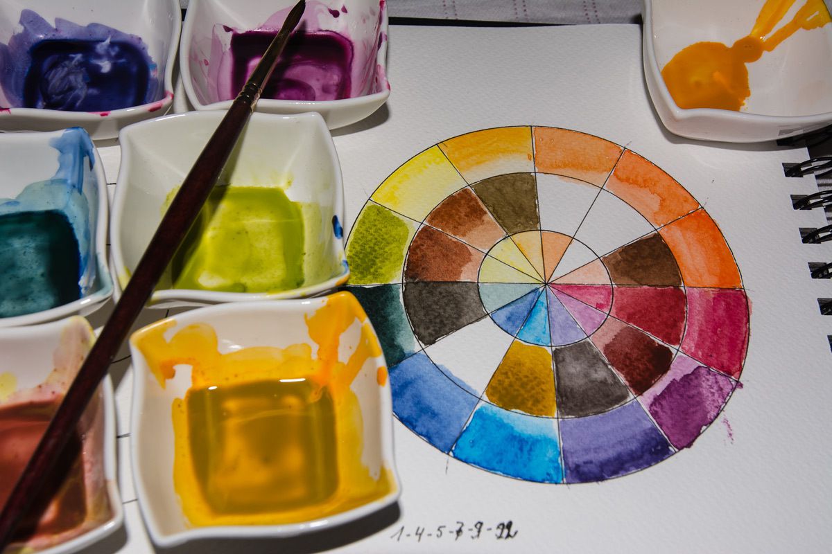
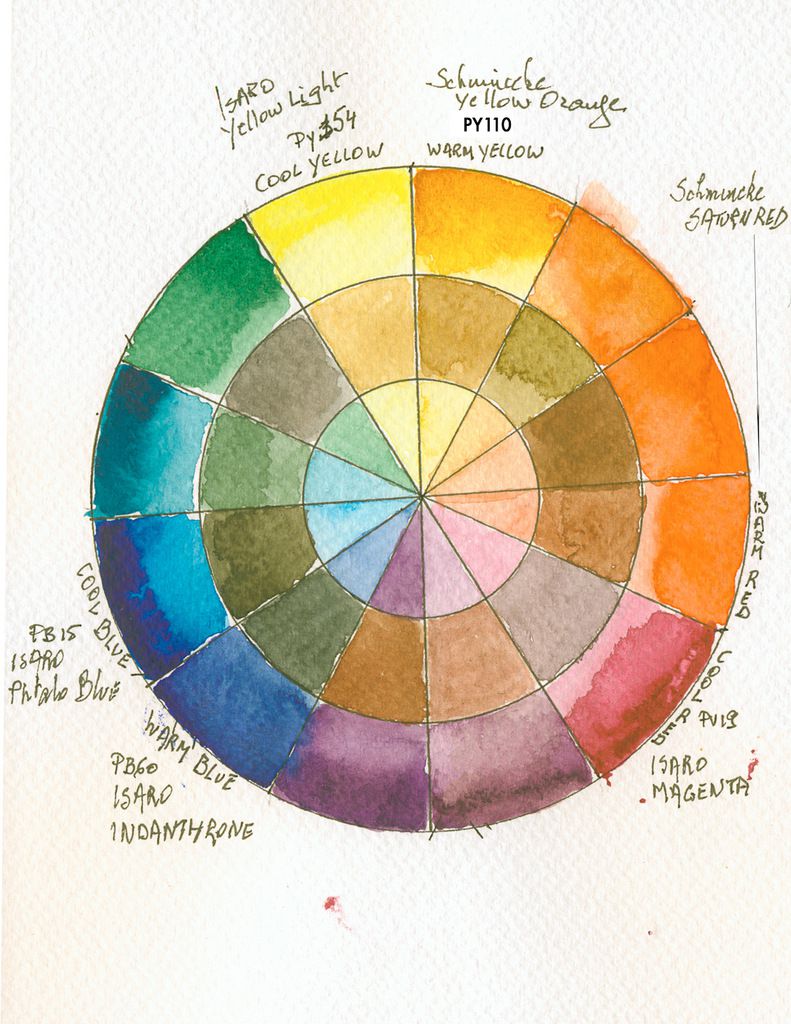
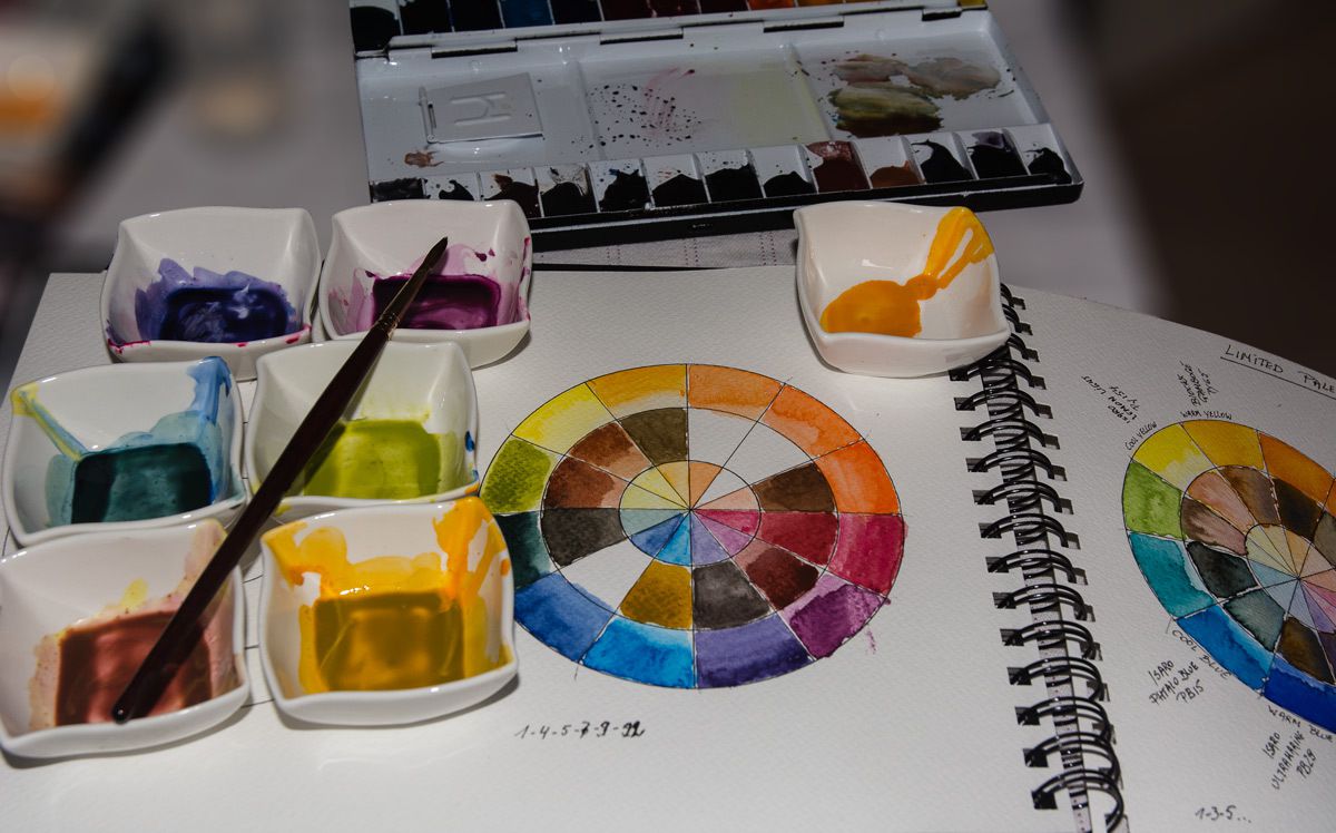
Before deepening the colour selection of the palette, I would like to show you how to make a colour wheel.
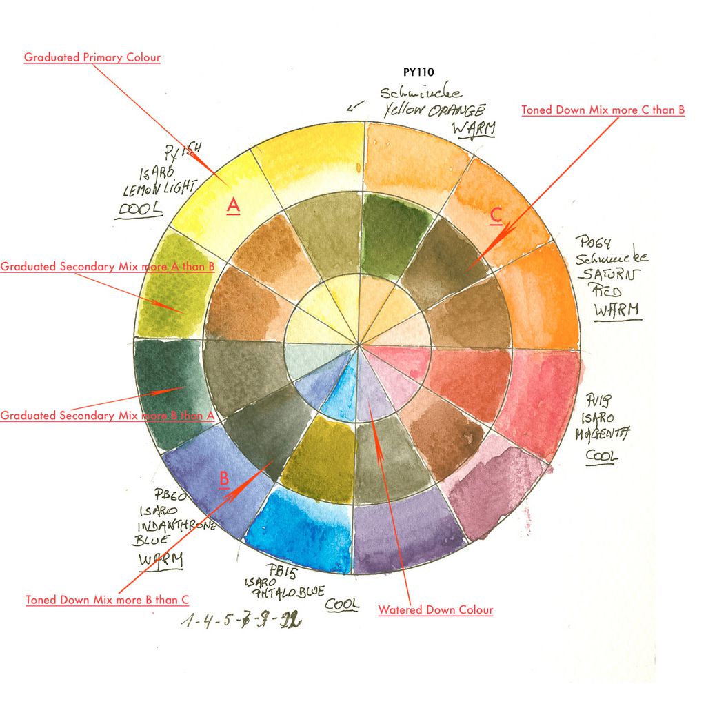
The colour wheel is composed of 12 squares, like a watch, and divided into 3 circles.
The outer circle comprises the three primary colours in hot and cold shades and two variants of the secondary mixtures. They are painted in light gradient, more sustained on the outside and more diluted inwards. I positioned the cold yellow at 11 am, the warm yellow at noon the red hot at 3 o'clock the red three at 4 o'clock, the warm blue at 7 o'clock and the cold blue at 8 o'clock. "On the example I inverted the blues, this gives more neutral tones ...".
In this way, secondary materials are obtained with or with less hot or cold tone. For example the green obtained at 10 am has more cold yellow than warm blue And the green at 9 o'clock has more blue than green.
The inner circle is filled with very diluted colours, The same ones I used in the outer circle.
The second circle or the intermediate circle is made using the counterpart opposite. For example. The blue indanthrene at 8 h was broken with C, or an orange with less yellow-orange than warm red. This is valid for the 12 boxes ... example, the 3 with the 9, the 4 with the 10, the 5 with the 11 and so on. You will find beautiful neutral, gray and even black ...
But now back to our palette. I tried, but not successful, for some blues, to find colours that don't stain or very little. If you use the technique of wet in the wet, it is very interesting to be able to find the white of the paper. But some staining colours prevent the use of this technique.
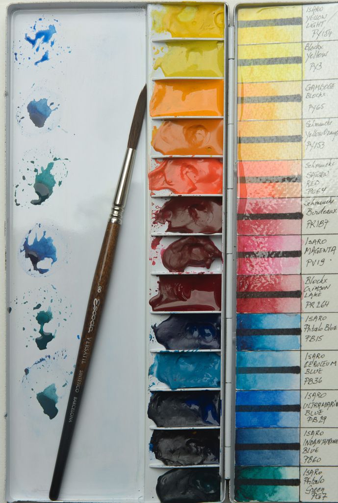
Here is the composition of the chosen palette:
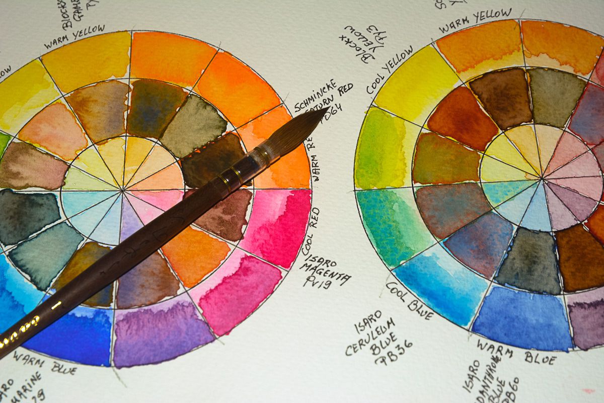
The yellows
Cold
⁃ PY154 Isaro light yellow
⁃ PY3 Yellow Blockx
Hot
⁃ PY65 Gamboge Blockx
⁃ PY110 Schmincke Yellow Orange
The Reds
Cold
⁃ PR264 Blockx Crimson Lake
⁃ PV19 Isaro Magenta
Hot
⁃ PR187 Schmincke Bordeaux
⁃ PO64 Schmincke Red Saturn
The Blues
Cold
⁃ PB15: 3 Isaro Blue Phtalo
⁃ PB36 Isaro Blue Cerulean
Hot
⁃ PB29 Isaro Blue Ultramarine
⁃ PB60 Isaro Blue Indanthrone
And last the Isaro Phtalo PG7 Green to create neutral and black with red and mix red red + warm blue.
Now up to you to discover the mixes made in these colour wheels.
It goes without saying that I here only show one possibility. Compose your palettes with the colours of your choice, but first think of the transparency of a colour by choosing a single-pigment shade, transparent with 2 shades of each primary in hot version and 2 in cold version. This is the solution to get almost all colours by mixing, without making them dull, opaque or muddy. If you prefer grainy colours, opt for these, but only if they are transparent or semi-transparent.

It is imperative to limit the number of your shades, I think 4 of each primary is largely enough. Depending on your tastes, take the least or colder or hot, but limit yourself. Otherwise you will lose yourself ... By limiting you will become expert in your mixes and you will not need more shades (With some exceptions, especially for watercolour painters of flowers (botany) that will need more reds ).
Naturally, afterwards you can add secondary colours to create certain shades faster. I think especially a violet quinacridone and a green (preferably mono pigment, but there are very few. Avoid the colours composed with black PBk .., prefer a green PR206 or Pbr7) and for those who like the earth colours, look out for transparent, mono pigmented hues as Quinacridones or PR101 (attention PR101 has transparent and opaque hues… like Venetian red that is very opaque), which allow a nice glazing and unlike ocher, do not create dull shades, less bright ...
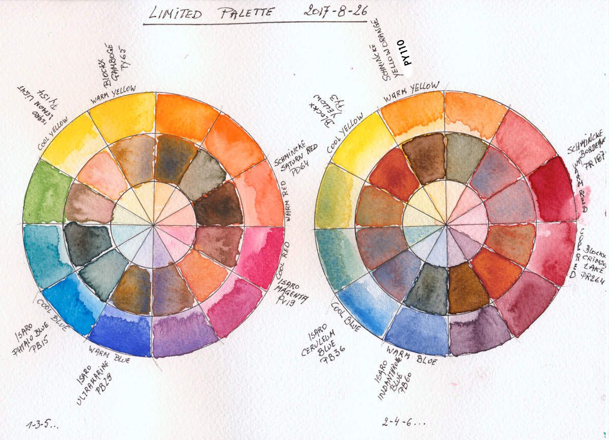
I made a mistake by switching the place of the warm and cold blue on the 3rd wheel (I admit that it was done on purpose). Then observe the result in blends of blue with cold yellow and hot red. The mixes are brighter by mixing a cold yellow with a cold blue and a cold red with a warm blue ... do the tests yourself and it will bring you more depth in your watercolours.
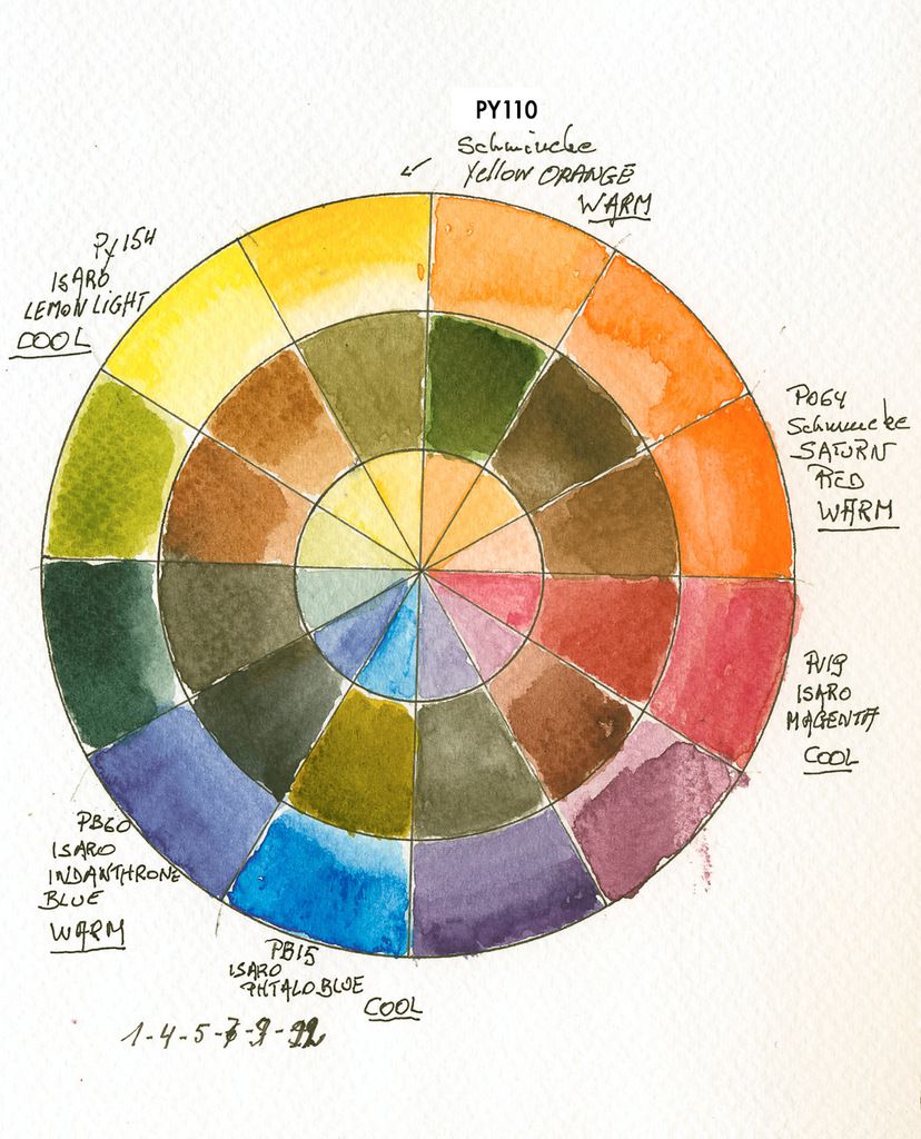
First is the right place for bleues, second is inverted painted with the Ultimate 13 Watercolour Palette
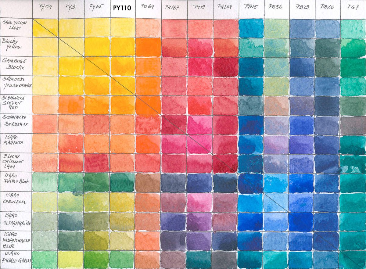
I made a colour chart using this palette, so you can see how the mixes works.

I have a large scan of these (nearly 3 Gb) and if you want i can send it by mail to you. Just verify that your mailbox accepts this hughe file and if so send me a message indicating your email and i'll send it to you.
To go a little deeper in colour behaviour, i made this small lexicon regarding the bases of the mixtures;
All artists know the primaries; yellow, red and blue.
Secondaries are obtained by:
Oranges
- ⁃ Hot oranges by hot yellow with hot red
- ⁃ The cooler oranges are obtained by mixing a hot yellow with a cold red or a cold yellow mixed with a hot red. The oranges obtained will be slightly broken because there is a little blue in the cold yellows and reds.
- ⁃ Dull oranges are the mixture of a cold yellow with a cold red, know that a cold yellow already contains a little blue and the cold red also has a blue shade. This will create already broken tones
The Purple, Violet and Lilac... Lavender aso...
The purple, violet, lilac or lavender are quite atypical, because for mixtures of blue and red the English language has several names. Depending on placement closer to red or blue a different name is given to this secondary colour. The yellows and greens do not have this characteristic one speaks of reddish orange and yellowish green, but always with the name of the secondary colour first. The name for the neutralized hue between red and blue is purple. The purple, which indicates a pinkish purple, and therefore towards the cold red, originates in the comparison of this shade with the plant the mauve, the flowers of which have this colour.
The definition of violet is today rather uncertain. In principle, washed with white, the violet becomes a mauve; a reddish purple is a purple, and a pale reddish purple is a rose. In practice, some authors do not clearly distinguish the three fields of purple, mauve and lilac in spite of or because of the efforts of colourimetry is an international discipline in which the American section of the International Commission on Illumination has played a decisive role 5. Colorimetry rigorously defines purples as the exact equivalent of "purple" in English, but outside this specialty, the same chromatic field, which extends over the chromatic circle of the blues to the reds, is divided into English between purple and violet . (source wikipedia).
Rest the lilac...
In a work written before the publication of the French standard, Maurice Déribéré distinguishes, for violet, a narrow field at the end of the colours of the rainbow between the indigo and the purple, with a distribution of fields of the other colour names very different from that retained.
The ambiguity of the colours of the chromatic field of violet, purple, and lilac can also be found in other European languages such as French and Spanish.
- The Violets warm by a warm blue with a cold red
⁃ Cold violet, closer to blue, and more dull are obtained by mixing a warm blue with a cold red or a cold blue mixed with a cold red. The mauves or violets obtained will be slightly broken because there is a little blue in the yellows and reds. They have a light brownish tone.
⁃ Dull violets are the mixture of a cold blue with a cold red, know that a cold blue already contains a little cold yellow and the cold red also has a warm blue shade. This will create broken tones with a brown dominance to see brown.
The Greens
- ⁃ Warm greens by a cold yellow with a cold blue
- ⁃ Cold, duller greens are obtained by mixing a cold yellow with a warm blue or a warm yellow mixed with a cold blue. The oranges obtained will be slightly broken because there is a little blue in the cold yellows and reds.
- ⁃ Dull oranges are the mixture of a warm yellow with a warm blue, know that the warm blue already contains a shade of red and that the warm yellow contains the red shade.
If you have problems understanding this deepening, take a few scraps of paper and try alternating the amounts of pigments in each shade. I painted them especially for you, because an image is much more explicit than pages full of sentences. I did use only 6 colours of the palette to paint out these mixing tables. I advice for purple to use a PV19 Magenta, this will make the purples more vibrant than those obtained with Crimson Lake (PR264). If you like paint down the other combinations.
Then the last explanation concerning the muted tones.
The muted tones are obtained by mixing a colour with its complement. If you have a primary colour, the complement will consist of a mixture of the other 2 primaries. The red will be complementary to a mixture of blue and yellow therefore a green. Depending on the placement of the red on the chromatic circle (more yellow, therefore hot ,or colder, therefore more blue trend), the complementary will be obtained by varying the opposite of the trend of the primary colour. Example: alizarin crimson red or madder lacquer have a blue tendency, so its green complement must have less blue than green. For ultramarine blue, red trend, the complementary orange is composed of less red than yellow.
In principle, when mixing a colour with its complement one must obtain a gray or black without any tendency. In practice, this makes it possible to obtain intermediate tones of coloured grey’s with shades of all colours (green, red, blue, yellow, orange, brown and even black if the ideal complement is found.
Know that we work with pigments with their own behaviour and that by muting the colours one can find very different effects, sometimes dull without interest, but also regularly one can find nuggets.
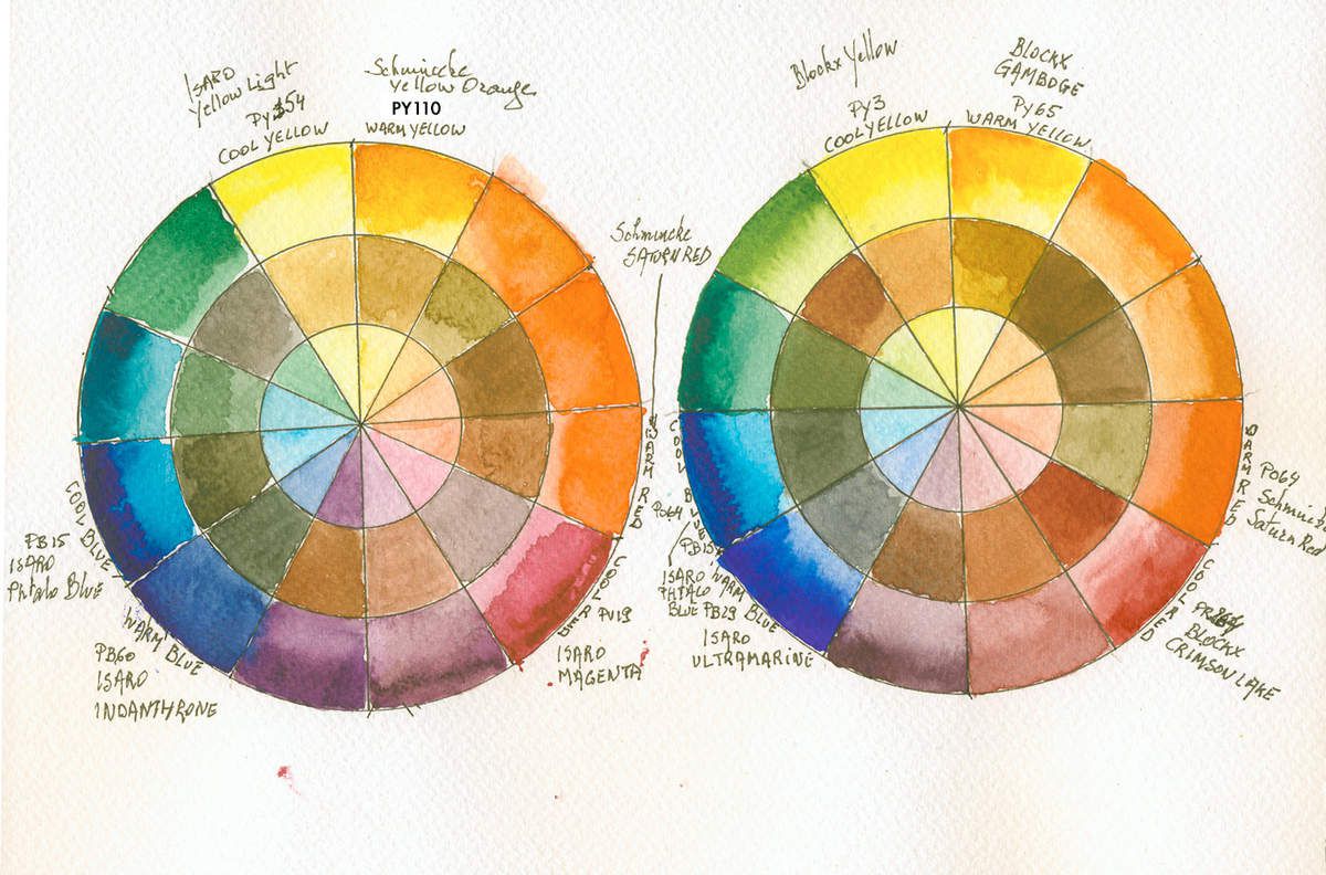
With these colours one can realise a lot of nuanced mixes and a lot of colour wheels ... I realised 5 to show you the difference. By using only this limited palette, you will soon master the mixes, but especially to be able to tarnish or break your basic mixtures. This allows you to create depth in your watercolours and find the desired shades. Note that I have neither gray, black or earth tones (Sienna, Ocher, Shadows etc ...), because one can obtain these colours by breaking your bright colours. It is the formula that makes it possible to have vibrance, transparency and shades nuances, which is not the case if you use land (often semi-opaque or opaque, causing muddy mixtures), black or gray (often composed of black with a hue of blue, green or earth, so alert if you want shiny, clear and transparent tints, yes I repeat myself ...)
Observations:
It's been 2 months since I paint with this palette. I am very happy, but I have two small reproaches;
- Red Bordeaux (colour I love is not hot enough, I think to replace it with a Red Pyrrole (PR254), red Pyrrole scarlet (PR255), Quinacridone Coral (PR209) or a Red Vermilion (PR188) I will do tests and colour wheels to set the best replacement.
- However, the blue is well balanced, I think I need less staining blue, because it is difficult to open whites (sky, sea etc ...) with the colours in the palette. It's very difficult to find transparent, non-staining blues. The Phtalo's are transparent but extremely staining. The ultramarine is transparent, moderately staining. The Cerulean, like the blue Cobalt are semi-opaque but not stain or produce little dyeing, Prussian blue is transparent but moderately staining, there is only the Smalt and Lapis Lazuli, which they are according to my information that marketed by Daniel Smith and are of mineral origin, which is transparent and non staining, but very very expensive ... If you have info do not hesitate to contact me. (Note: Lapis Lazuli from Daniel Smith and Schmincke are grounded and milled pigments made from the semi-precious stone Lapis Lazuli. But the pigment wasn't extracted as the old paintmakers did, so the result is a duller grayish blue not worth the splendid blue as seen in the Sitene Chapel in Rome)
Conclusion:
I am very satisfied with my palette, apart from the small remarks above. It is sure that I will use other pigments, if the subject requires it, but I think I will remain true to this version, see to extend it with a blue and 2 extra red. I will post my observations after tests on this blog.
I do think this palette is made for a lot of artists between us. If you want to deepen the art of watercolour, if you like vibrant and transparent colours, if you like rich shadows and contrasts and especially if you like quality without too much expense, this is a solution.
To set this palette up you’ll need to spend less than 60 € - 60 $, if you opt for tubes of 5 to 7 ml, or less of 100 €/$, if you opt for 15 to 21 ml. It is admittedly more expensive than boxes of 12 see 24 half-pans student quality watercolour, but significantly less than boxes of 12 to 24 half-pans of extra-fine watercolours.
Be aware that with a tube of 21 ml it is possible to easily fill 6 half-pans and with tubes of 5 to 7 ml 2 half-pans. So it is not one but 2 to 6 refills that you have and wont contain colours that you do not want or almost not use ... enough to invest in good paper, because for me the paper is the most important in watercolour, more important than paint quality and certainly more essential than brushes.
The quality will be there and it remains for you to learn how to mix these colours, to know the specificities of the pigments and to put all that in your masterpieces ...
You can find the colours and / or Palettes at these resellers online
Pallets, Blockx and or Schmincke
https://www.jacksonsart.com/blockx-watercolour
http://www.dickblick.com/products/blockx-artists-watercolors/
http://www.dickblick.com/products/schmincke-horadam-aquarell-artist-watercolors/
http://www.wetpaintart.com/by-brand/s/schmincke.html
https://www.jacksonsart.com/colour/watercolour/watercolour-paint/brand/schmincke
http://www.saa.co.uk/paint-colour/watercolour-paint/schmincke-artist-watercolours
Blockx direct from manufacturer
http://www.blockx.be/en/produits/aquarelles.asp
Isaro direct from manufacturer
If you are interested in going further in the knowledge of colour and pigments, I advise you to consult these books or sites
Books in French:
- La couleur expliquée aux Artistes by Isabelle Roelofs and Fabien Petitillion ISBN 978-2-212-13486-5
- Le grand livre de l’aquarelle by Janine Gallizia ISBN 978-2-9538151-3-9 (bilingual French / English)
- Le guide de la Couleur by Mireille Cardon ISBN 978-2-7565-2130-5
- Faire Chanter la Couleur à l’Aquarelle by Jeanne Dobie ISBN 2-04-720054-7 (More available new and very expensive used see between 150 and 650 €)
Books in English
- Making Color Sing by Jeanne Dobie ISBN 978-0-8230-3115-3
- The complete book of Watercolour Janine Gallizia ISBN 978-2-9538151-3-9 (bilingual French / English)
- Color Mixing Bible by Ian Sidaway ISBN 0-8230-0723-5
- 1500 Color Mixing Recipes by William F. Powell ISBN 13: 978-1-60058-283-7
- The Watercolour guide to Exceptional Colour by Jan Hart ISBN 987654321 (sold out and very expensive used, can be obtained in ebook / pdf from the author http://janhart.com/index.php/product-category/books- ebooks /)
Sites and Blogs to visit
French
- My blog naturally;)
- http://secrets-d-aquarelle.skyrock.com/1242885882-Secrets-d-aquarelle-CHAPTER-9-LES-COULEURS-et-LES-MELANGES-le-cercle.html
- http://paulineartgallery.com/blog/
- https://tribulationsdemarie.com/blog/
English
- http://www.janeblundellart.com/building-your-palette-of-colours.html
- http://www.handprint.com/HP/WCL/water.html
- http://watercolorpaintingandprojects.com/basics/setting-up.html
- http://brendaswenson.blogspot.fr
If you have any suggestions or questions, feel free to contact me.
© George Desire Herman 2017 All rights reserved